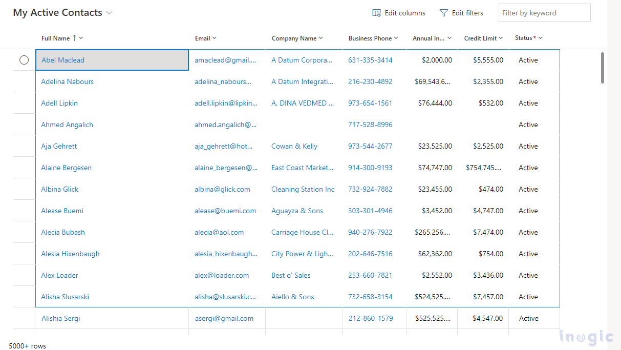
With the Power Apps grid control, users can view, open and edit records from view and sub-grids, an evolution of Power Apps read-only control.
In our previous blog, we saw how users can edit records within the grid and do infinite scrolling until they find the records they are interested in. Also, they can configure editing, filtering, and navigation properties while adding control.
This blog will show some new properties of Power Apps Grid control while configuring it. Using these properties, it is possible to customize the visual appearance of columns based on specific requirements.
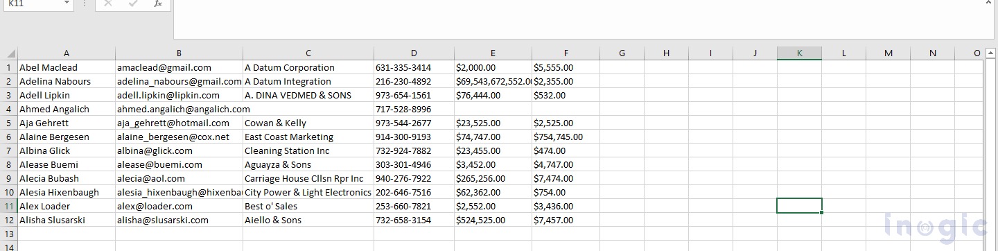
If a salesperson wants to sort data according to primary field initials and by visualizing the records wants to copy and paste it into other applications like excel, word, etc., using a customizer control, the developer (by using a script) can color code the columns’ values and visualize it on grid control.
Follow the same steps as mentioned in the previous blog to add Power Apps Grid Control.
1. Allow Range Selection: This property is by default set to yes. You can select a set of records or a subset of the grid to copy data to other applications using this property.
You can paste data to other applications like excel.
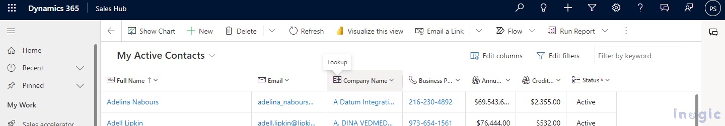
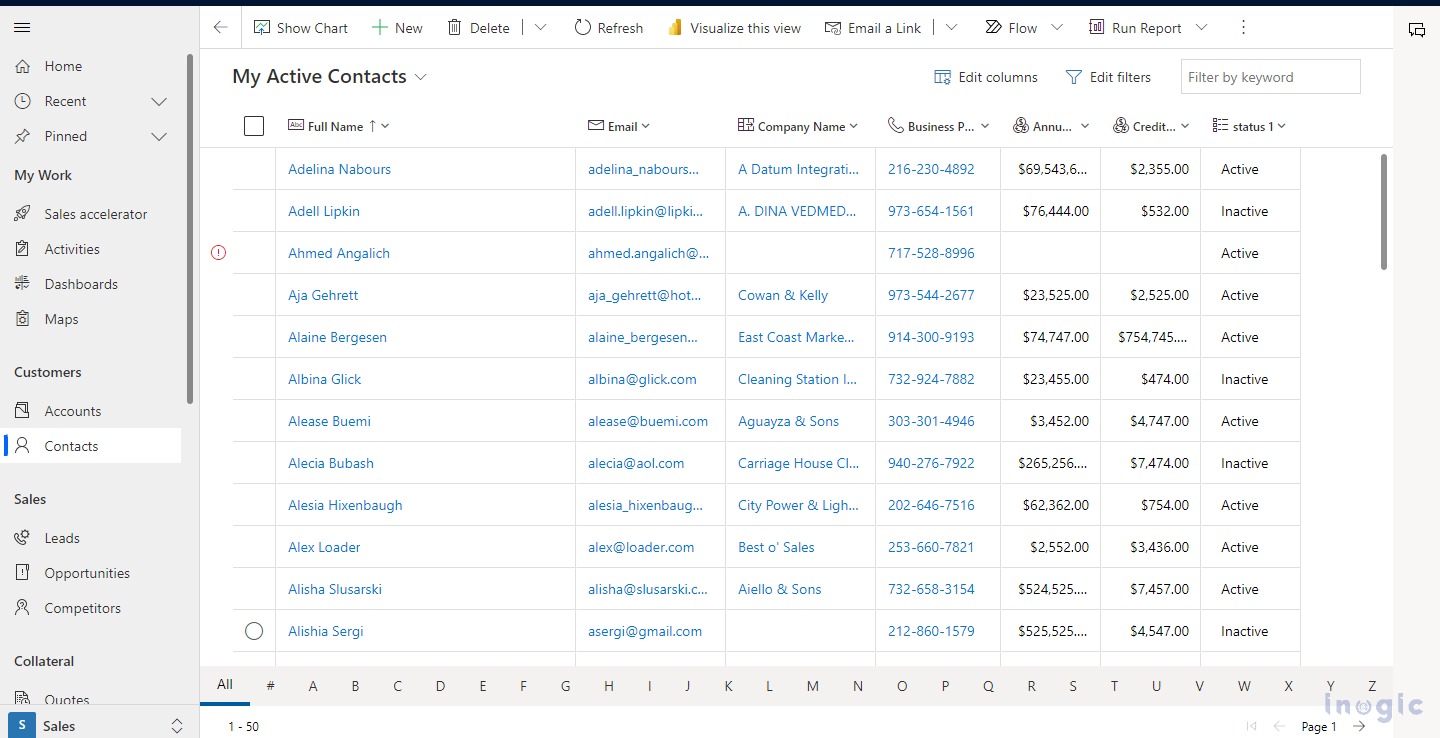
2. Enable jump bar: This property is by default set to No. An alphabetical list can be displayed at the bottom of the views or subgrid using this property.
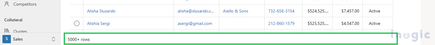
Below is the screenshot of the jump bar enabled.

3. Enable Pagination: This property is by default set to No. Data can be browsed using modern scrolling (infinite scrolling) and paging buttons by setting this property. You have to set this property as Yes to disable infinite scrolling.

4. Enable Status column: This property is by default set to To hide the Status column( Record selection checkbox) you have to set this property as No.
4. Show data type icons: This property is by default set to No. By setting this property to Yes Data type icons will be displayed in the column header. On hover of the icon, the datatype name will be displayed.
 5. Customizer Control: In the customizer control property, several columns in a grid can have their visuals or interactions changed by linking to a single customizer PCF control.
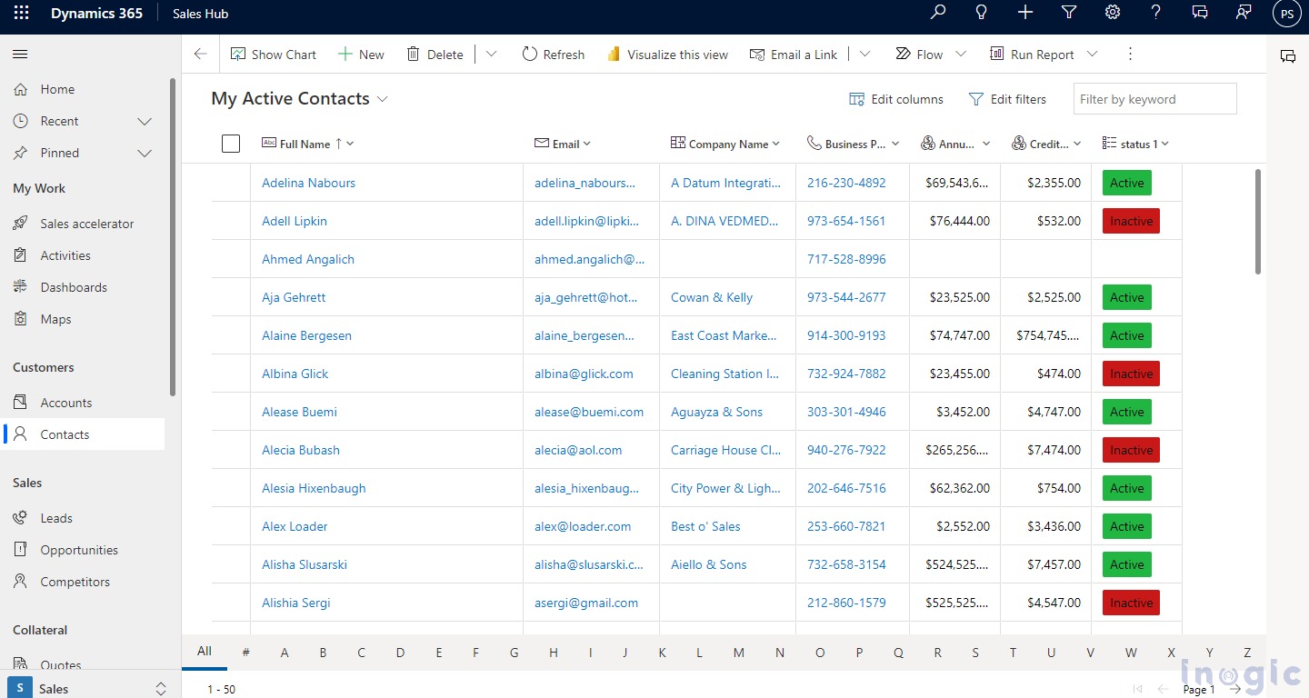
6. Enable option set color: This property is by default set as No. When the Enable OptionSet color property is enabled, the background color of each value in the choice column will be shown with its corresponding value. If you are enabling this property for a table, be sure to check the color configuration for each choice column to ensure that the content is accessible and easy to read.
Below is the screenshot after the option set color is enabled.
Conclusion
Using this property users can customize its Power Apps Grid control, which will eventually replace all read-only and editable grids in model-driven apps.