Efficient sales processes are key for any successful business. The Predictive forecasting feature which is available in Microsoft Dynamics 365 Sales Insights, enables proactive decision-making for any aspect of the sales process.
Recently when I was exploring Predictive forecasting I came across the new setup available for configuring the Trend and Flow chart. In the previous blog, we have already seen how to enable the Trend chart and Flow chart but at that time there was no direct option available to turn them on.
Earlier, to enable the Trend and Flow charts visualization, we needed to turn on the Sales Insights setting additionally.
In this blog, we will have a walkthrough of enhanced configuration available for the Trend chart and Flow chart within Microsoft Dynamics 365 Sales Insights.
Enable Trend chart using the “Show in Trend Chart” checkbox setting:
The Trend chart is now available as a part of the Predictive forecasting feature.
You need to select/deselect the “Show in Trend Chart” checkbox at the time of configuring the specific column inside the forecast configuration.
Navigate to App settings > under Forecast configurations > Open the appropriate “Forecast configuration” record > navigate to the “Layout” step > under the appropriate column (e.g. Won column) > click on the setting icon as highlighted below:
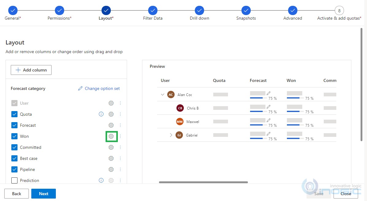
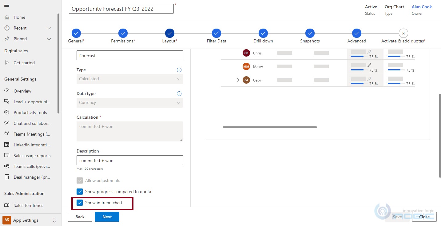
Once you click on the setting icon, the below setting page opens up wherein at the bottom of the page you have a checkbox for “Show in Trend Chart” as shown below:
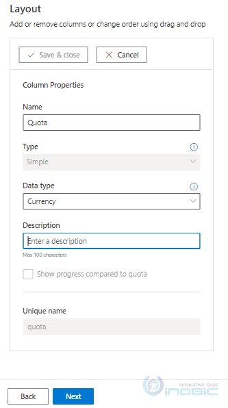
NOTE: only Roll up and Calculated type columns have the checkbox option for “Show in Trend Chart”, for other types of columns (e.g. Quota column which has Simple type) this checkbox option is hidden as shown below:
Using the Trend chart, we can view the summary of a forecast category at a given time by hovering over the trend line.
You can refer to the below screenshots:
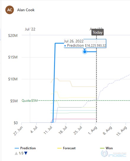
NOTE: The Prediction for the Forecast gets updated every 7 days.
Navigate to Sales > Performance > Forecasts > select appropriate forecast record “Opportunity Forecast FY Q3-2022” as shown below:
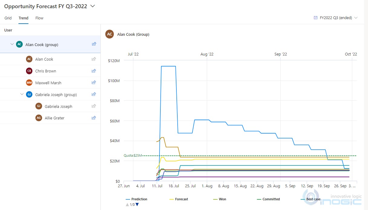
As shown in the above screenshot, the categories displayed on the trend chart depend on the forecast grid columns that we have configured. It will show all the comparisons between Forecast Categories with distinct colors till the Present day.
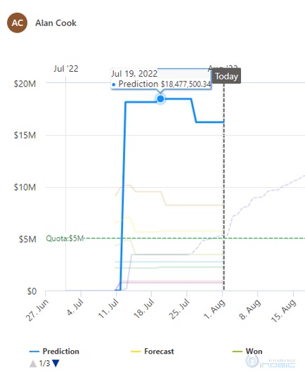
NOTE: The blue line (Predicted Realization line), is automatically created to project future revenue over time. You can find more details of the Trend chart in this doc.
When you hover over the blue dotted line, you can see the projected prediction revenue as well. As shown below:
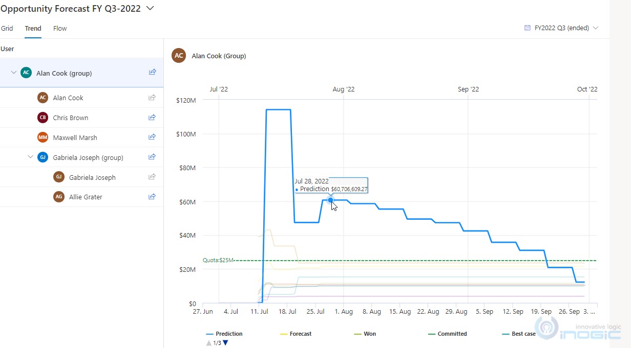
NOTE: The Predicted Realization line, will indicate the total combined value of ‘Predicted from New’ and ‘Predicted from Open’. We can see the Predicted Realization value while hovering on the line. It will show the value date-wise. For more details about Predictive forecasting components, you can refer to our previous blog.
We can view the summary of a specific forecast category at a given time by hovering over the trend line. The summary displays the date, forecast category, and aggregated opportunity amount.
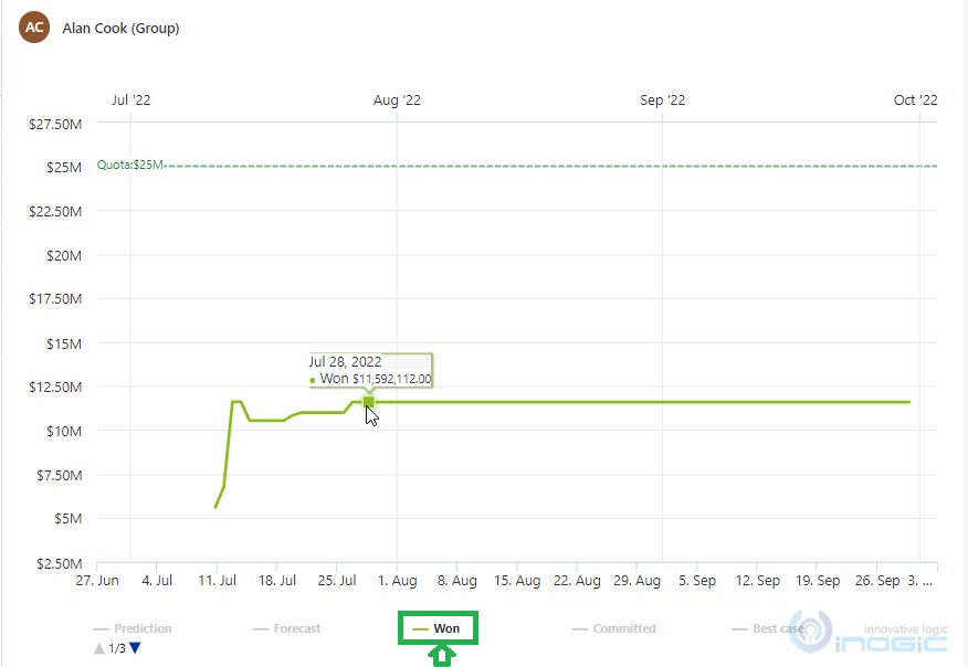
Here one thing to notice is, we can click on any Forecast Category option once on the Legend, then, that Forecast Category will get greyed out. Again, if, we do a single click on that forecast category option on the Legend, then, the trend line will start viewing again on the chart. As shown in the above screenshot we are interested in only the “Won” forecast category hence we kept only that enabled (by clicking on it) and have disabled others (as you can see all are greyed out).
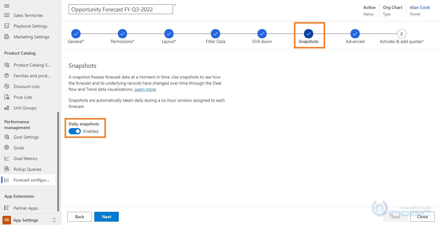
Enable Flow chart using the “Daily Snapshots” checkbox setting:
Under Forecast configurations > navigate to the “Snapshots” step > turn on the setting of “Daily Snapshots” as highlighted below:
Once, the Forecast is activated, it takes around 6 hours to generate the first Snapshot.
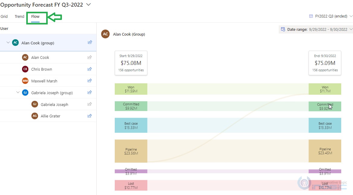
Navigate to Sales > Performance > Forecasts > select the appropriate forecast record “Opportunity Forecast FY Q3-2022”, Besides the Trend tab, there is the Flow tab as shown in the below screenshot:
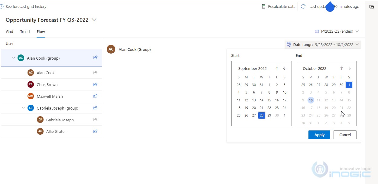
To view a snapshot from a specific date, click on the Date Range section, and choose a specific Date range, during which you want to see the data.
NOTE: If the user selects the disable date and clicks on “Apply” from the calendar displayed for selecting the date range then there won’t be any snapshot loaded for those dates only for the Active Date range, Snapshots are available. Refer to the below screenshot:
With these Snapshots, we can easily analyze data between the periods during the forecast, which helps us understand how the deals flow during particular date ranges. You can find more details of the Flow chart in this doc.
Conclusion:
Predictive Forecasting is beneficial for making data-driven decisions and running the business effectively. Trend chart & Flow chart features are available as a part of Predictive Forecasting improving the Forecast Accuracy.
With the help of the Trend Chart, we can get an idea of the project’s future revenue over time. By simply comparing it against the prediction values and quota.
With the help of the Flow Chart snapshots, Managers can get an approximate idea to emphasize the deals, which have contributed to the increase or decrease in the forecast commitment.