Introduction:
In this blog, we will see how we can test entity form (OOB, Custom) on different devices such as Desktops, Tablets, and Mobile Phones using Power Apps.
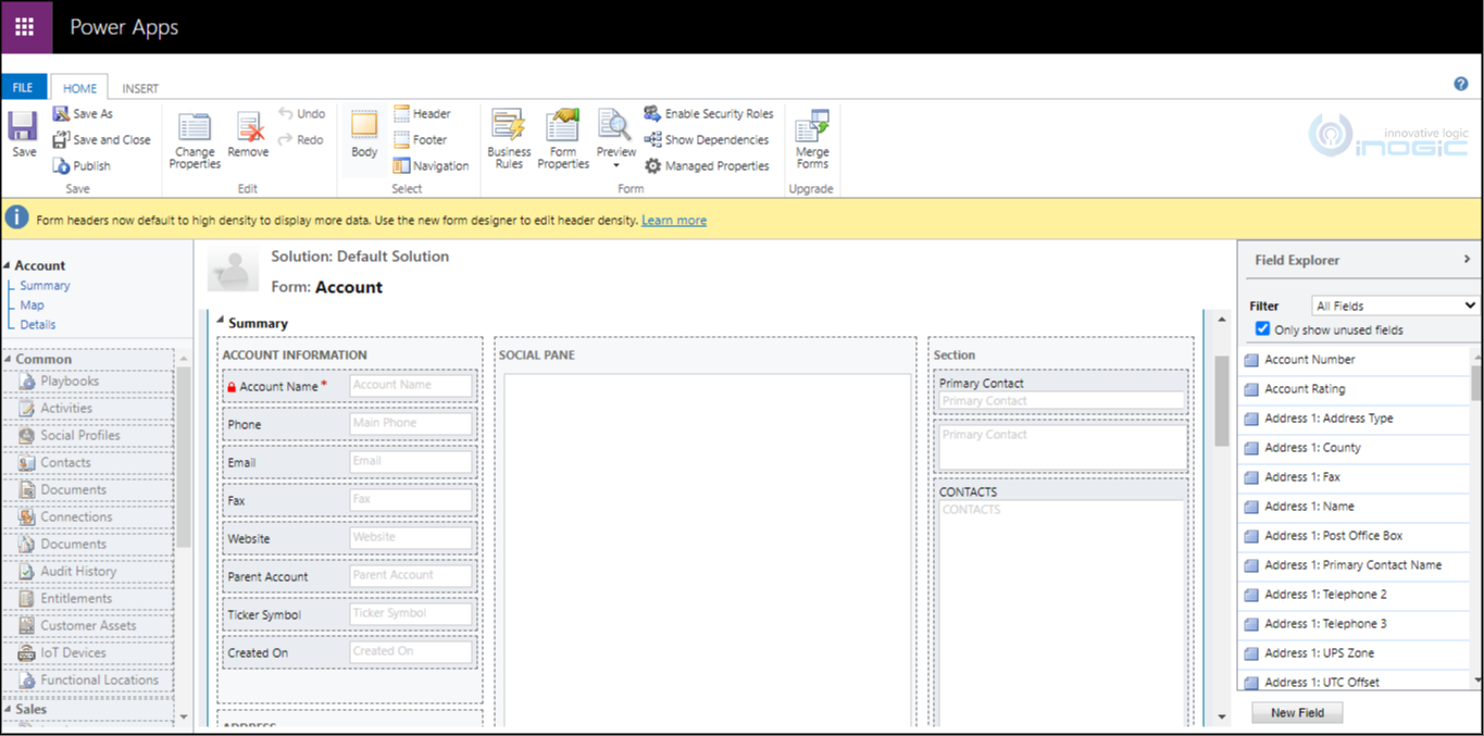
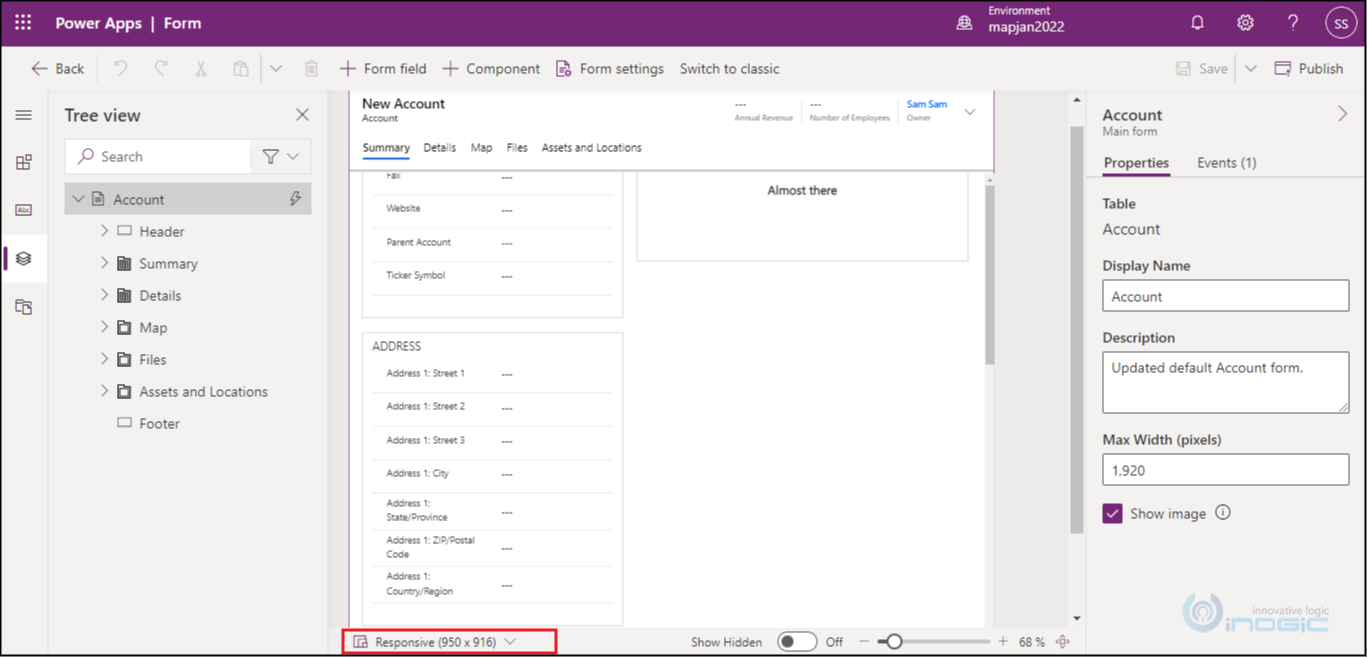
When we use classic mode to customize entity form, we don’t get the ability to preview the designed entity from on different resolution. To test the form on different devices we have to save all customized parts and check on different devices (Desktops, Tablets, and Mobile Phones) one by one.
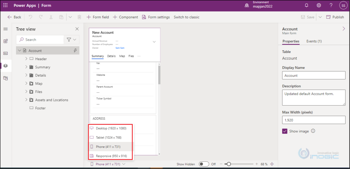
On other hand, when we do the above steps by using Power Apps, we get the ability to preview the entity form on different devices. Given below are the resolution of devices required for preview:
- Desktop (1920 x 1080)
- Tablet (1024 x 768)
- Phone (411 x 731)
- Responsive (800 x 800)
For Mobile Phones:
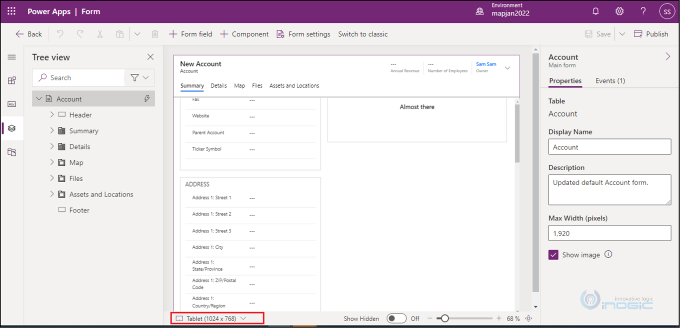
For Tablets:
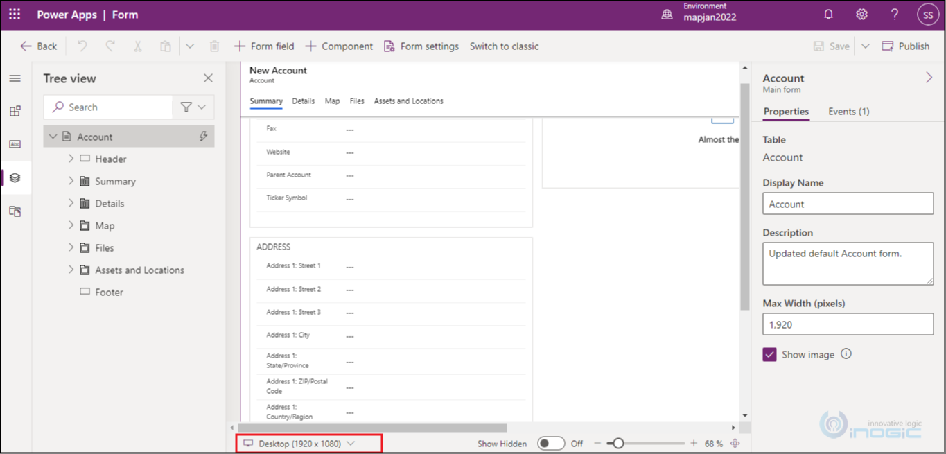
For Desktops:
For Responsive:
Conclusion:
In this way, we can easily check form customizations on different screen resolutions on a single panel using Power Apps.