Introduction
Recently Microsoft has released the preview of the new horizontal and vertical container in the Canvas apps layout. While building the apps it is essential that apps are uniform and responsive within any type of device or different screen sizes for an optimized user experience. These layout containers improve the creation of responsive apps with less effort.
Let’s see how we can use this layout container in our apps.
To enable this feature:
1. Go to the respective app and navigate to the File > Settings > Advanced Settings > Enable Layout containers as shown below:
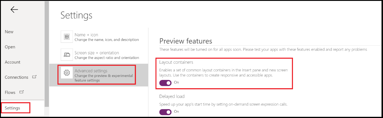
Note: The Horizontal and Vertical Container feature is in preview.
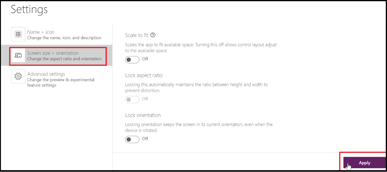
2. Also, make sure to disable the below setting and click on the Apply button:
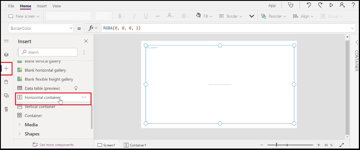
Then, go to the Home screen > Insert > Layout > Horizontal container and add it to the canvas. This will add the blank layout on the canvas and we can add containers inside this layout.
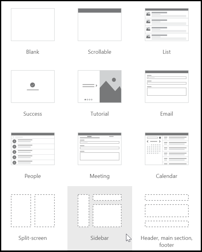
Or, we also get three new screen templates as Split-screen, Sidebar / Header, Main Section, and Footer with the prebuilt responsive capabilities as shown in the below screenshot. To get the screen template, go to New Screen, select the required screen, and add it to the canvas.
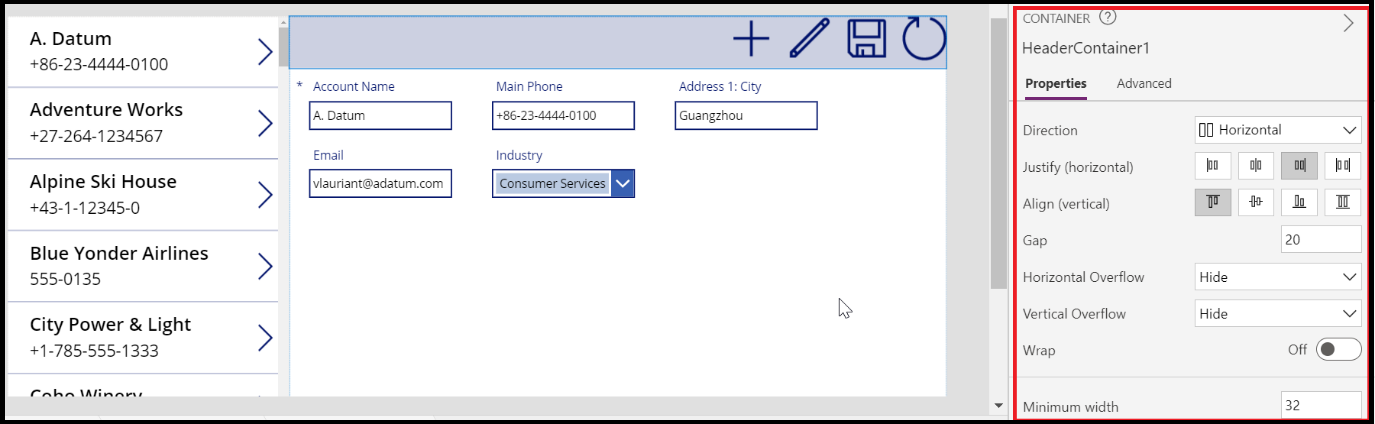
For instance, I have selected the Sidebar screen, it will automatically add multiple containers on the canvas. I have designed my app by adding the Account entity as a data source. When we select any container, it opens the Properties window where we get the options to properly align the controls.
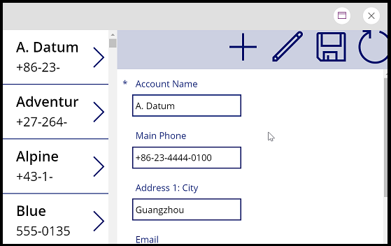
So whenever we resize the browser, the app automatically gets aligned according to the size. See the below screenshot for reference:
Conclusion
Using these new horizontal and vertical containers in the Canvas apps layout, users can create responsive apps to ensure a great user experience.