Introduction
Microsoft is continuously working on enhancing the maker experience for app design. The new maker experience is all about designing the pages throughout. These custom pages bring the power of Canvas apps into model-driven apps.
We have already seen the modern app making experience in the previous blog when the modern app designer maker experience was in preview. But with the recent release, you will observe this modern app-maker experience is OUT OF PREVIEW and this feature is ready for production deployment. Also, you can refer this blog to learn how to include the standalone custom page in the model-driven app navigation.
In this blog, we will continue with the same example of adding a gallery component with the contacts listed. Moreover while adding custom pages in a model-driven app we will explore how with the help of container controls and the PowerApps formula we can make the custom pages responsive in nature.
Checkpoints
While adding custom pages in a model-driven app make sure to maintain responsiveness because the model-driven app has the inbuilt capability of being fully responsive in nature but custom pages do not.
If you scroll to different screen resolution sizes you will find the model-driven app components are responding accordingly and fit different resolution sizes without doing anything. While creating or adding pages if you want to maintain the same responsiveness you can achieve this by enabling a responsive layout with container controls. You can find more details about it in this doc.
Responsive custom pages configuration set up:
For this demonstration, I added a gallery component with contacts with and without a responsive layout as below:
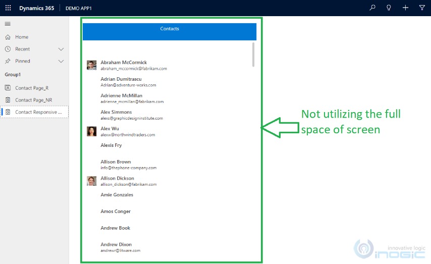
Contacts page without responsive layout in the app navigation:
As you can observe in the below screenshot, a page added in navigation has not filled the entire space of the screen and has not been resized based on available space.
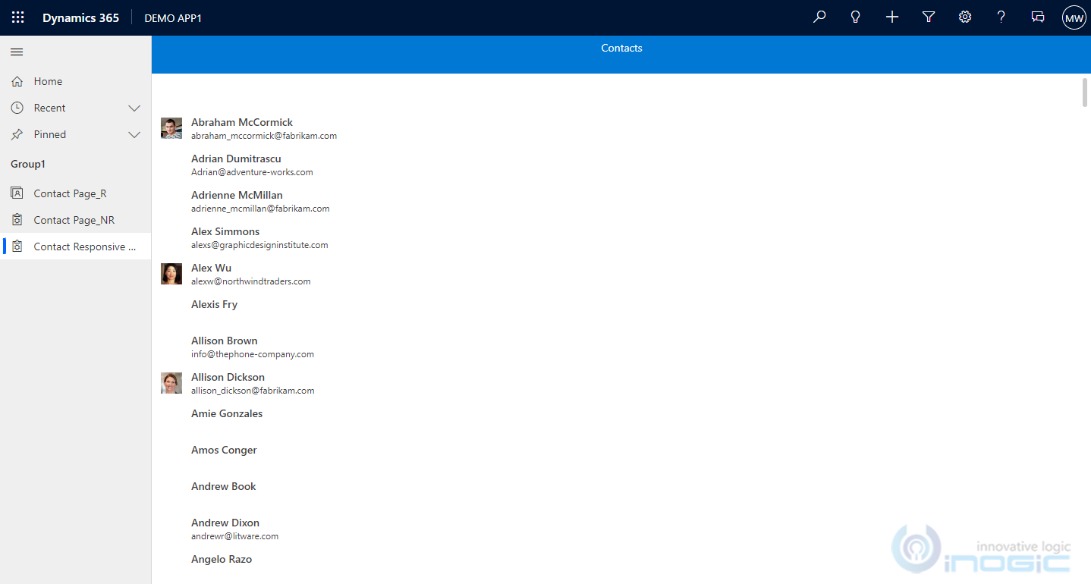
Contacts page with responsive layout in app navigation:
By using responsive layouts and implementing formulas you can configure custom pages to fill the entire space and to resize based on available space as shown below:

For making the responsive page take the help of layout components of “vertical container” and “horizontal container” and adjust the properties from dropdown menu (explained later).
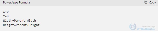
To design responsive page simply set the topmost container to fill the entire space and go on adding another components inside this container so that they will be responsive too. Make the use of below Power Apps formula for configuring the top most container properties for responsiveness:
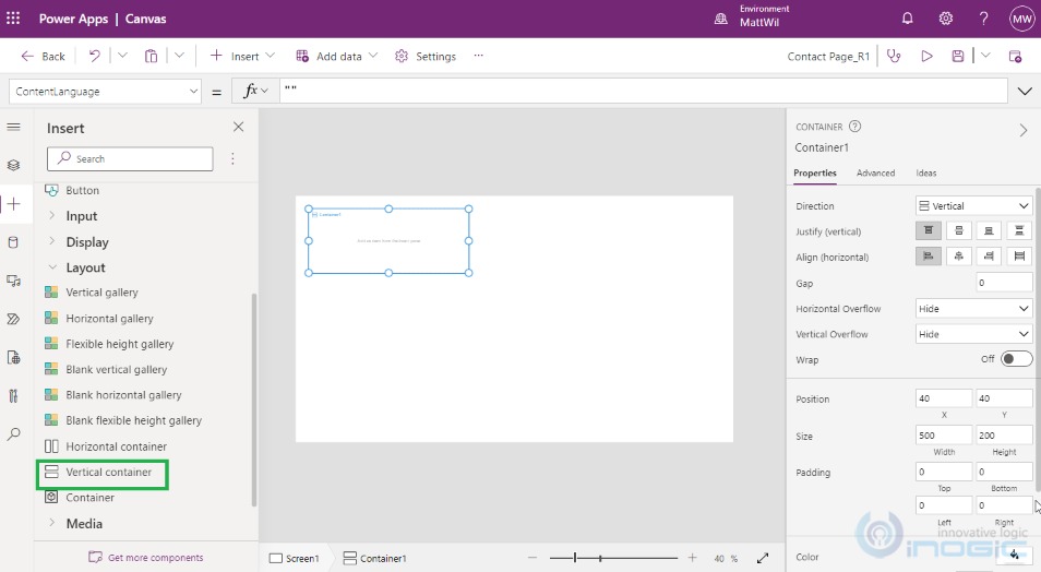
In the “Tree view” navigate to Layout and Insert the “Vertical container” as shown below:
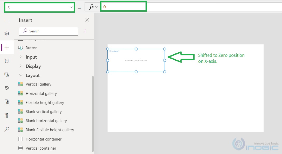
Within the “Vertical container” from the dropdown list of properties, select the “X” property which we are going to set to zero.
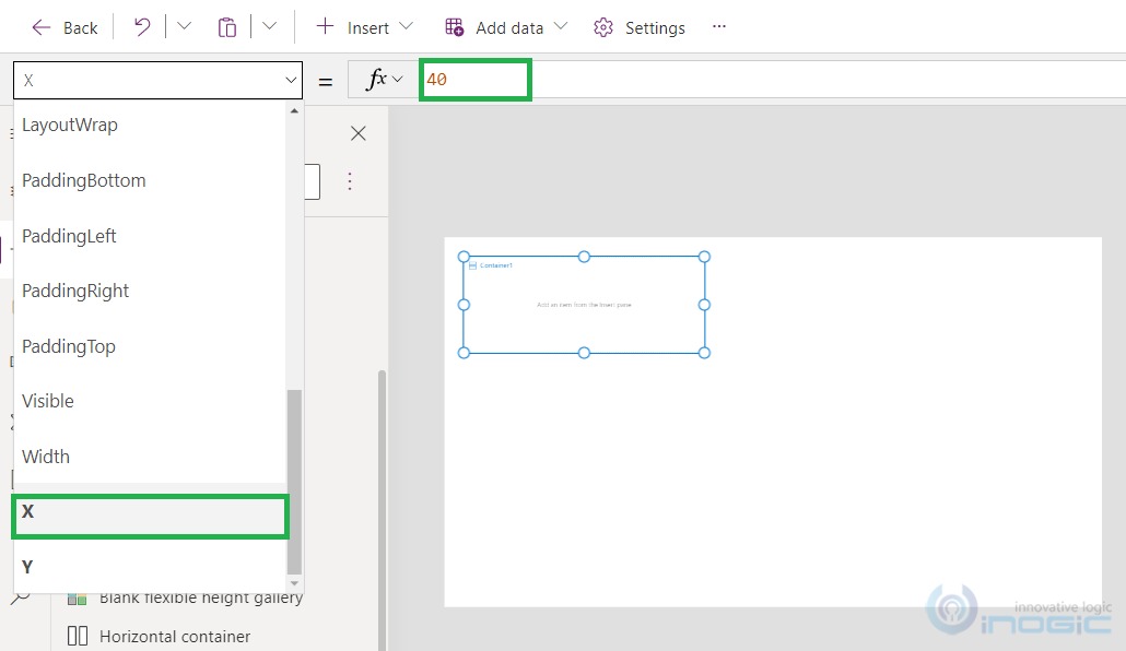
Post changing “X” property to zero, observe the changes happened to vertical container. It shifted at the X=“0” position as shown below:
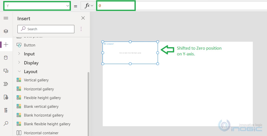
Similarly, change the “Y” property to zero, and observe the changes that happened to vertical container. Here, it shifted at the Y=“0” position as shown below:
After this, we want the total width and height to resize based on the width and height of underlined parent whole screen.
We will select the “Width” property from dropdown of properties and rather than absolute value we will implement the formula here Width=“Parent.Width” as shown below:
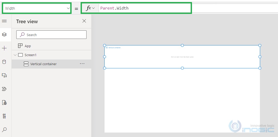
NOTE: This formula makes the width same as that of parent width, which is the whole screen here.
Similarly, change the “Height” property from the dropdown of properties, and rather than the absolute value we will implement the formula here Height=“Parent.Height” as shown below:
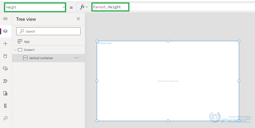
NOTE: This formula makes the height which is same as that of the parent height, which is the whole screen here.
As shown above, post properties changes above, container has now accommodated the complete whole screen as shown in above screenshot.
Once done, quickly add other components like label and contact gallery etc.
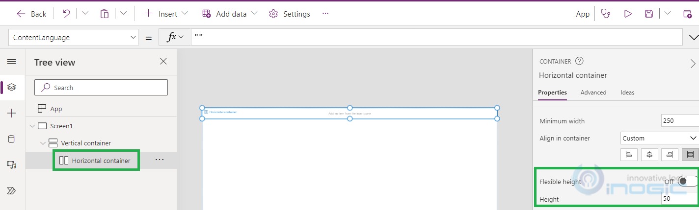
Adding Horizontal container:
Under the top most vertical container add a horizontal container and you will observe that it will also start working as a responsive component. For the label you can adjust the height as per desire.
Provide any desired absolute value (for e.g. = 50) in the “Height” property by turning off the “Flexible height” property as highlighted below:
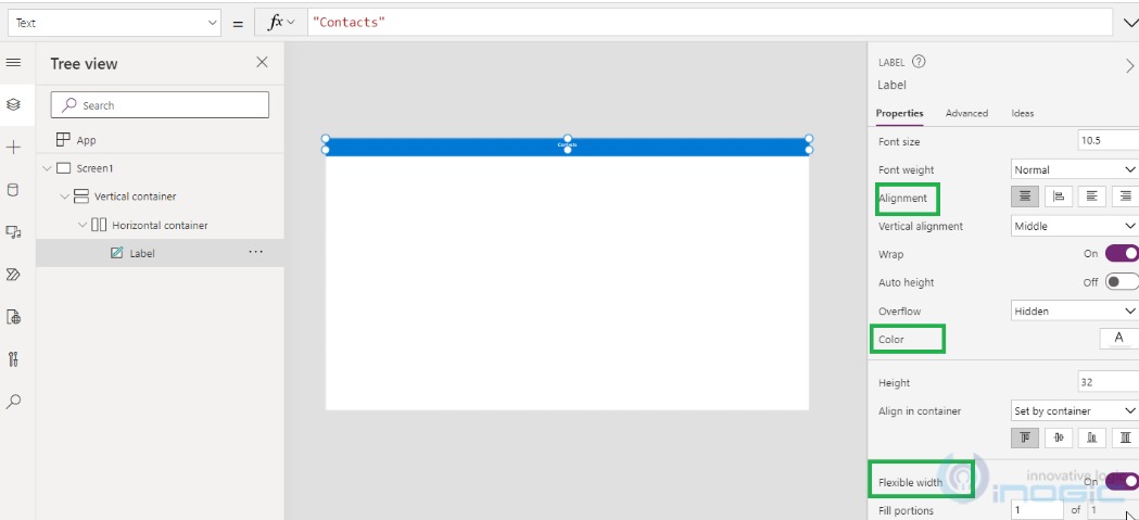
Adding Label within the Horizontal container:
After adding label under the horizontal container, you can configure “Alignment”, “Color”, and “Flexible width” as highlighted below:
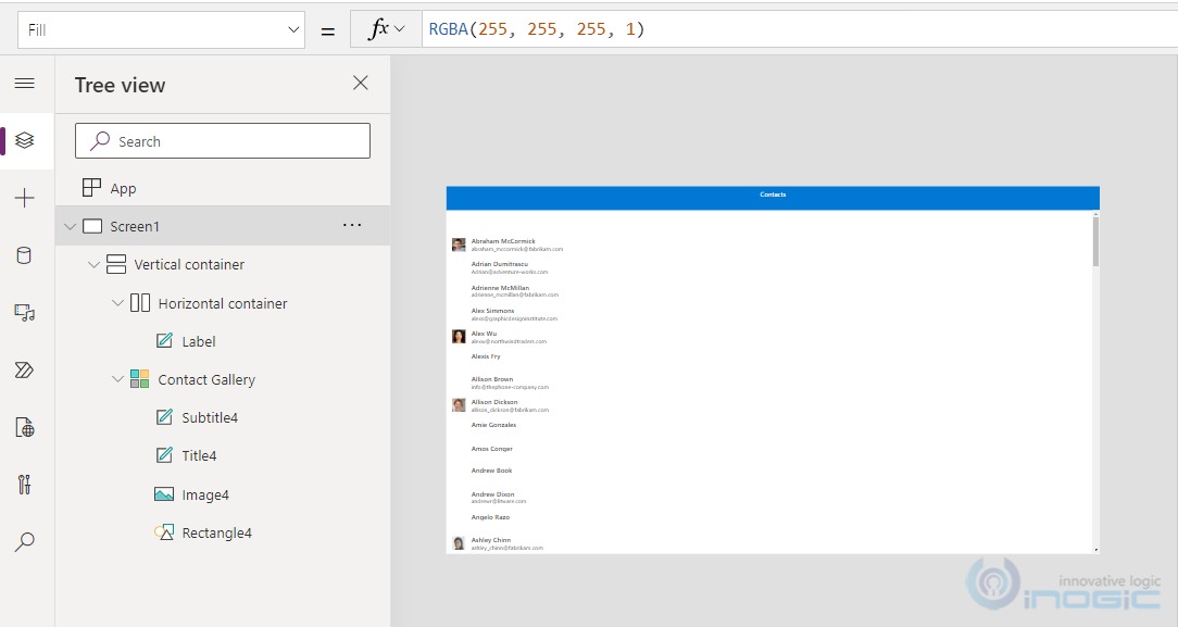
Adding Contact Gallery within the top most Vertical container:
Add contact gallery under the top most vertical container. It will also work as aresponsive component and will accommodate the whole space.
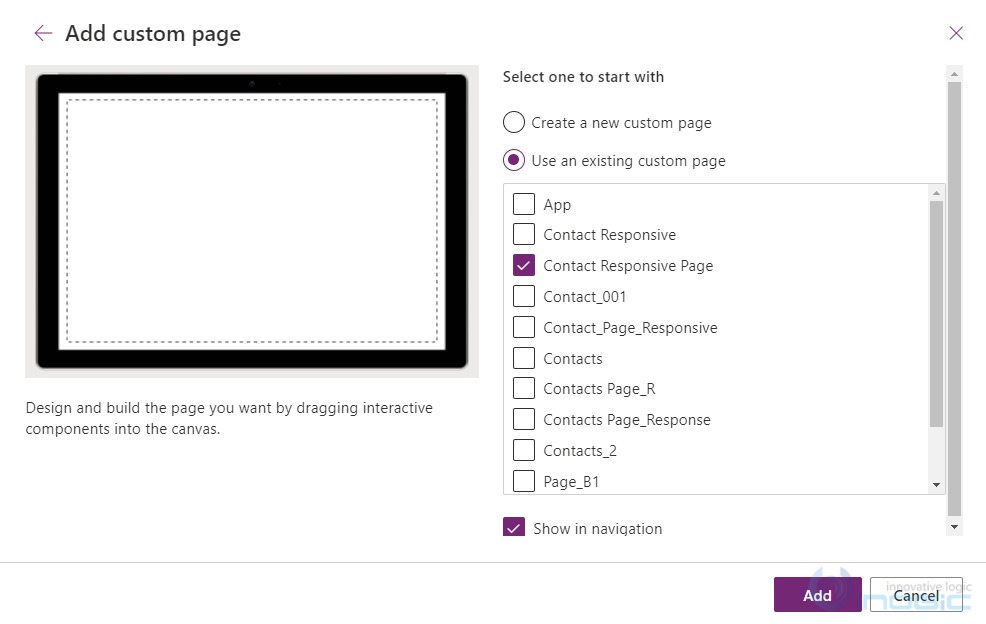
Post this changes add the page in Model driven app and you are good for using this page within model driven app.
Adding the custom page in the model driven app:
And here you can see that the added contact page in app navigation is fully responsive in nature:
Conclusion
In this way, with the help of container controls we can make responsive layouts for the custom pages while adding it into model driven app.
Let us help you with application building!
Want to visualize and build up a Model Driven App atop your steady, working framework?
We’ll help you to add components to your Apps, breezily. Contact us at crm@inogic.com and our Microsoft Dynamics 365 and Power Platform Inogic- Professional Services Division will help you at every step of the process!