In the last blog, we saw how we could match the theme of the Dynamics 365 App in PCF when we know what should be the color scheme at the time of designing.
In this blog, we will see how we can apply the theme to the Fluent UI component dynamically based on the main color set in the Dynamics 365 App Theme record.
Retrieve theme record
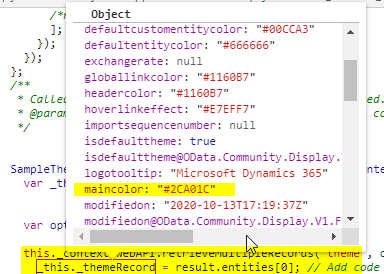
To know what the main color is set in the theme record, we would need to retrieve the theme record first. Use webApi.retrieveMultipleRecords method in the updateView method of the PCF and on success, render the react component. Pass the object of the theme record to the root main component.
public updateView(context: ComponentFramework.Context<IInputs>): void {
//retrieve theme
let options = “?$filter=isdefaulttheme eq true”;
this._context.webAPI.retrieveMultipleRecords(“theme”, options).then((result) => {
this._themeRecord = result.entities[0];
// Add code to update control view
ReactDOM.render(
React.createElement(App, { context: this._context, themeRecord: this._themeRecord }), this._container);
}, (error) => {
});
This theme records contains the maincolor value.
Generate Fluent UI Palette color slots
We now have maincolor but do not have the palette color slots. We want different shades of the main color, which we saw, in our previous blog; we copied the color slots from Fluent UI Theme designer.
To generate color slots programmatically, we would need to use ThemeGenerator Class. I have created a ThemeProvider.ts as a separate file with the below code.
import { loadTheme } from ‘@uifabric/styling’;
import {
IThemeRules,
ThemeGenerator,
themeRulesStandardCreator,
} from ‘office-ui-fabric-react/lib/ThemeGenerator’;
import { getColorFromString } from ‘office-ui-fabric-react/lib/utilities/color/getColorFromString’;
import { IColor } from ‘office-ui-fabric-react/lib/utilities/color/interfaces’;
export default class ThemeProvider {
private themeRules: IThemeRules;
constructor() {
const themeRules = themeRulesStandardCreator();
ThemeGenerator.insureSlots(this.themeRules, false);
ThemeGenerator.setSlot(themeRules.backgroundColor, getColorFromString(‘#ffffff’) || “”, false, true, true);
ThemeGenerator.setSlot(themeRules.foregroundColor, getColorFromString(‘#000000’) || “”, false, true, true);
this.themeRules = themeRules;
}
public loadThemeForColor(hexColor: string): void {
let col: IColor = { str: “#0078D4”, r: 0, g: 120, b: 212, hex: “0078d4”, h: 0, s: 0, v: 0 };
const newColor: IColor = getColorFromString(hexColor) || col;
const themeRules = this.themeRules;
ThemeGenerator.setSlot(themeRules.primaryColor, newColor.str || “”, false, true, true);
this.themeRules = themeRules;
const theme = ThemeGenerator.getThemeAsJson(this.themeRules);
loadTheme({
…{ palette: theme },
isInverted: false,
});
}
}
This ThemeProvider.ts has “loadThemeForColor” method, which accepts the color string and then generates theme and loads it.
Load theme in the root component
Import the above-created “ThemeProvider” class in the main root component and then call “loadThemeForColor” method by passing the maincolor that we have retrieved from the Dynamics 365 Theme record. The theme loaded in the root component will get applied to all the child components.
import ThemeProvider from “../ThemeProvider”
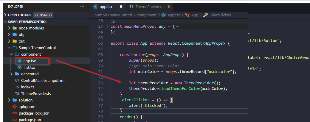
Call “loadThemeForColor” method before any app code. Here I have called this function in the root component’s constructor.
constructor(props: AppProps) {
super(props);
//get main theme color
let mainColor = props.themeRecord[“maincolor”];
let themeProvider = new ThemeProvider();
themeProvider.loadThemeForColor(mainColor);
}
This way we can dynamically set the theme for the Fluent UI components.
Test the app
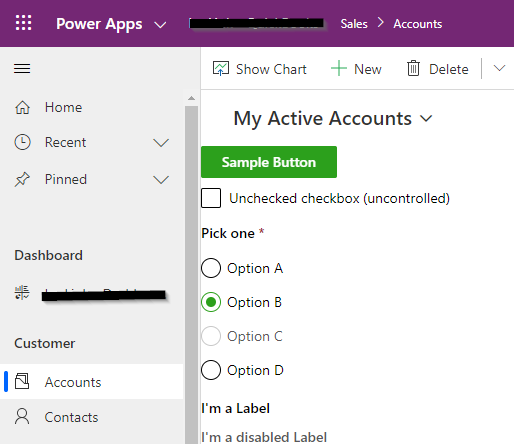
Deploy the control to Dynamics 365 environment, change the default theme main color, and publish.
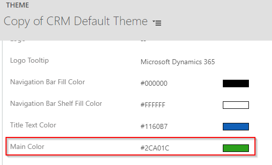
Our component will read this main color form the theme record and will apply the generated theme.
In some cases, you may require to modify individual components style. As mentioned in the previous blog, we can modify individual component style using https://github.com/microsoft/fluentui/wiki/Component-Styling
Conclusion
We can apply the theme to the Fluent UI component dynamically based on the main color set in the Dynamics 365 App Theme record.