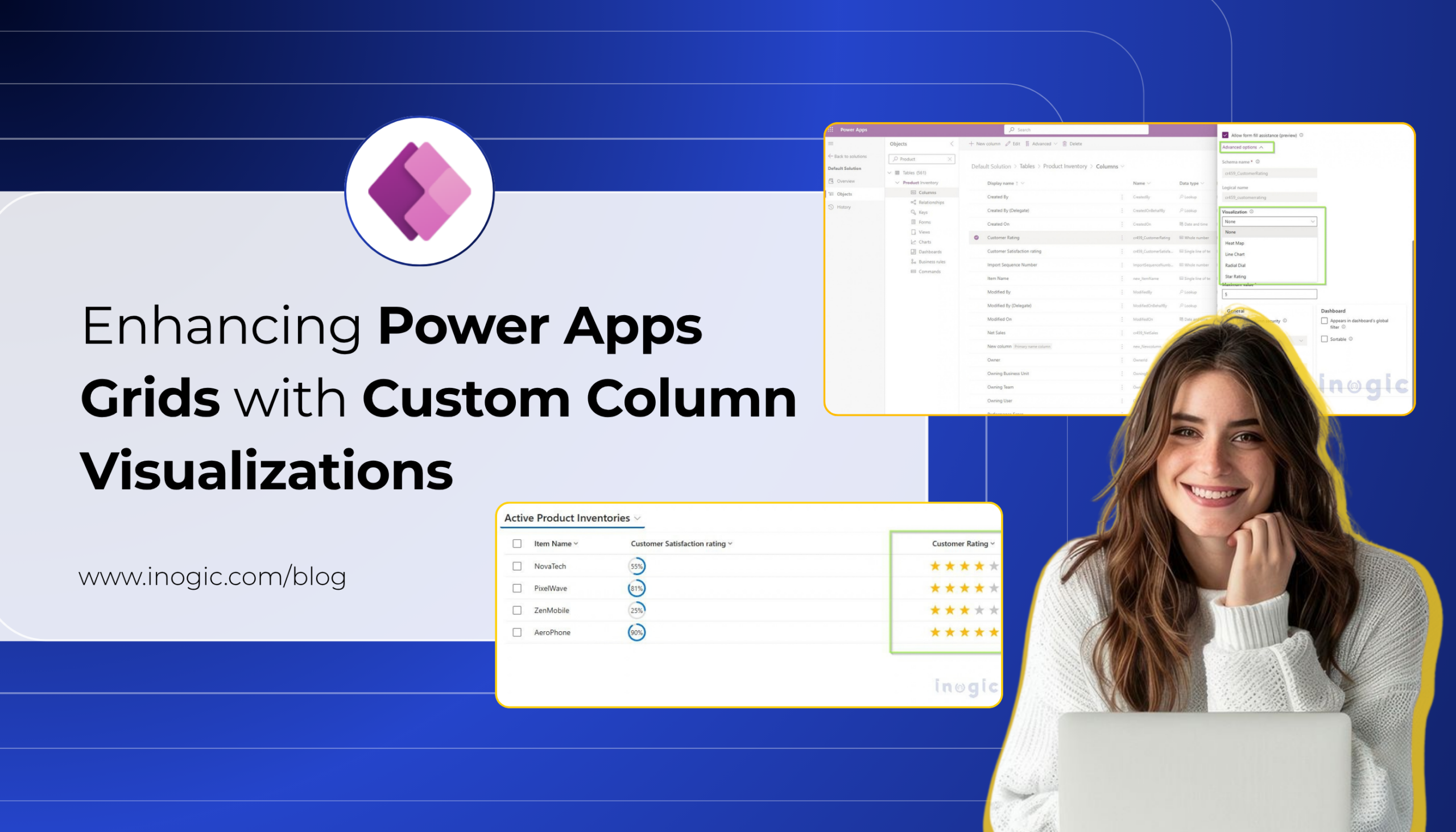
Displaying data in a Power Apps or Dataverse grid is one of the most common ways for users to work with business information. However, when a grid contains several numeric values, displaying everything as plain text can make it difficult to quickly understand and compare the data.
Key Takeaways
- Custom Column Visualizations let grid columns display data as Radial Dials, Line Charts, Heat Maps, or Star Ratings instead of plain text. No PCF controls or web resources required.
- Visualizations are configured directly on the column through Advanced Options, and once saved, apply automatically across every grid or view using that column.
- Each visualization expects a specific data format (e.g., comma-separated numbers for Line Charts, whole numbers 0–100 for Radial Dial), so data preparation matters for accurate results.
- This is currently a preview feature, so it should be evaluated carefully before being used in production environments.
PCF controls and web resources are still relevant for fully custom visualizations, but for common scenarios, this native option cuts out development, deployment, and maintenance work.
For example, consider a mobile phone company that uses Power Apps to track the sales and performance of its products. The company may have a table containing yearly sales data for its brands such as NovaTech, PixelWave, ZenMobile, and AeroPhone.
| Product | Q1 Sales | Q2 Sales | Q3 Sales | Q4 Sales |
| NovaTech | 200 | 80 | 350 | 520 |
| PixelWave | 75 | 300 | 321 | 487 |
| ZenMobile | 600 | 423 | 400 | 275 |
| AeroPhone | 391 | 391 | 700 | 846 |
Although the information is available, users need to read and compare the numbers manually to understand which products are performing better or how sales are changing over time.
Traditionally, organizations that wanted to provide a more visual experience inside a grid could use custom development approaches such as Power Apps Component Framework (PCF) controls or web resources. These approaches provide flexibility, but they also require additional development, deployment, and maintenance.
This is where Custom Column Visualizations for Grids can help.
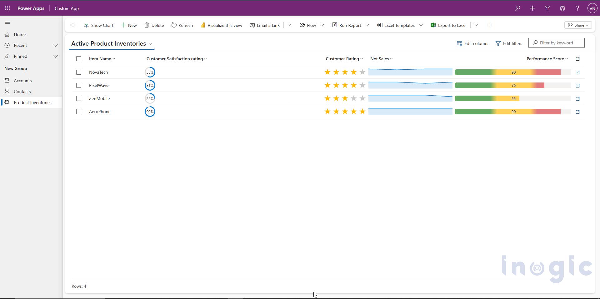
Custom Column Visualizations allow column values to be displayed as small graphics directly inside grid cells instead of plain text. With this capability, common visualization requirements can be handled through column configuration rather than requiring a custom PCF control or web resource.
The available visualization options are:
- Radial Dial
- Line Chart
- Heat Map
- Star Rating
The visualization is configured directly on the column. Once saved, any grid or view that displays that column automatically shows the selected visualization.
Note: Custom Column Visualizations for Grids is currently a preview feature and may change before becoming generally available.
From Custom Development to Native Visualization:
Before Custom Column Visualizations were available, organizations that wanted to display data graphically inside a grid could implement custom UI using PCF controls or web resources.
For example, if the bakery wanted to display its product sales as a visual indicator instead of showing only a number such as 780, a developer could create a custom PCF control or web resource to render the value graphically.
While these approaches provide flexibility, they can also introduce additional work:
- Development and testing of custom code
- Deployment through solutions
- Maintenance when requirements change
- Dependency on developer resources
Custom Column Visualizations provide a native alternative for the visualization types supported by Power Apps. Instead of developing a custom component for a supported visualization, an administrator can select the required visualization directly from the column properties.
Available Custom Column Visualizations:
Custom Column Visualizations provide four graphical display types, in addition to the standard text display.
| Visualization | Suitable for |
| Radial Dial | Percentages and progress values |
| Line Chart | Trends represented by multiple values |
| Heat Map | Values within a defined range |
| Star Rating | Ratings and scores |
Each visualization expects the data to be stored in a specific format.
How to Configure a Custom Column Visualization:
Follow the steps below to configure a visualization for a column.
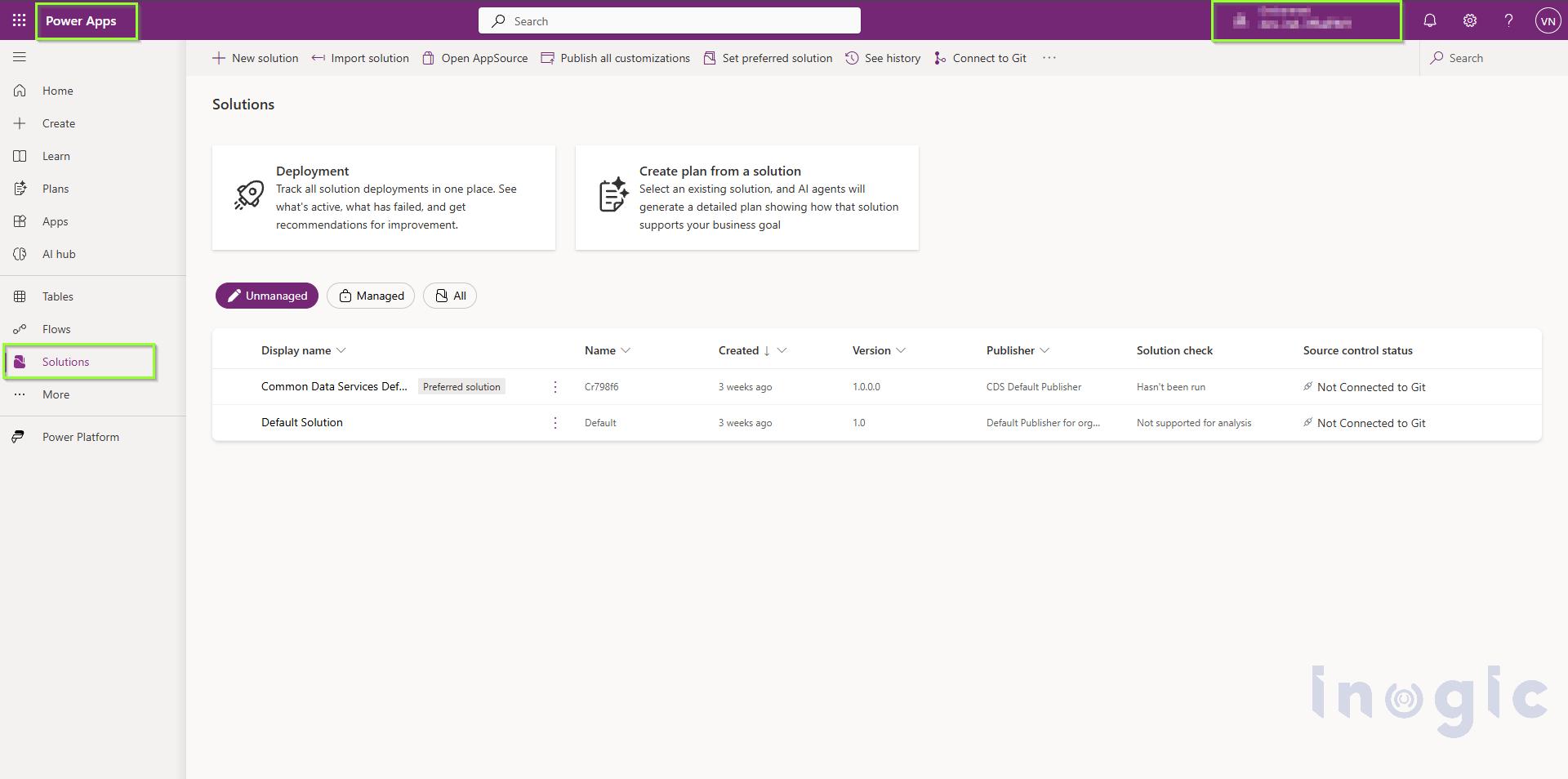
Step 1: Open Power Apps
Sign in to Power Apps and select the required environment.
From the left navigation pane, select Solutions.
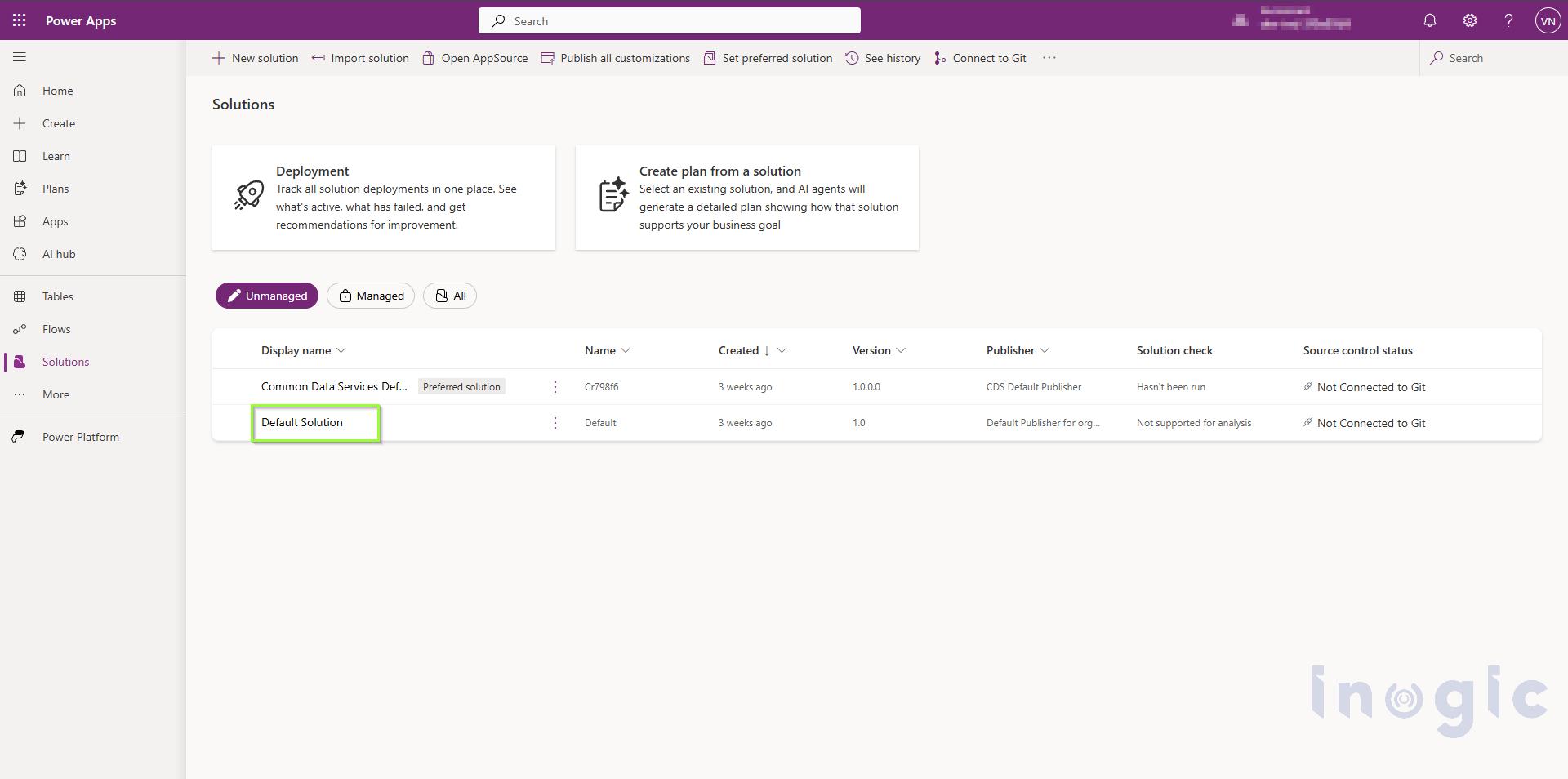
Step 2: Open the Required Solution
From the list of available solutions, open the solution that contains the table you want to modify.
Step 3: Open the Table
Open the required table from the solution.
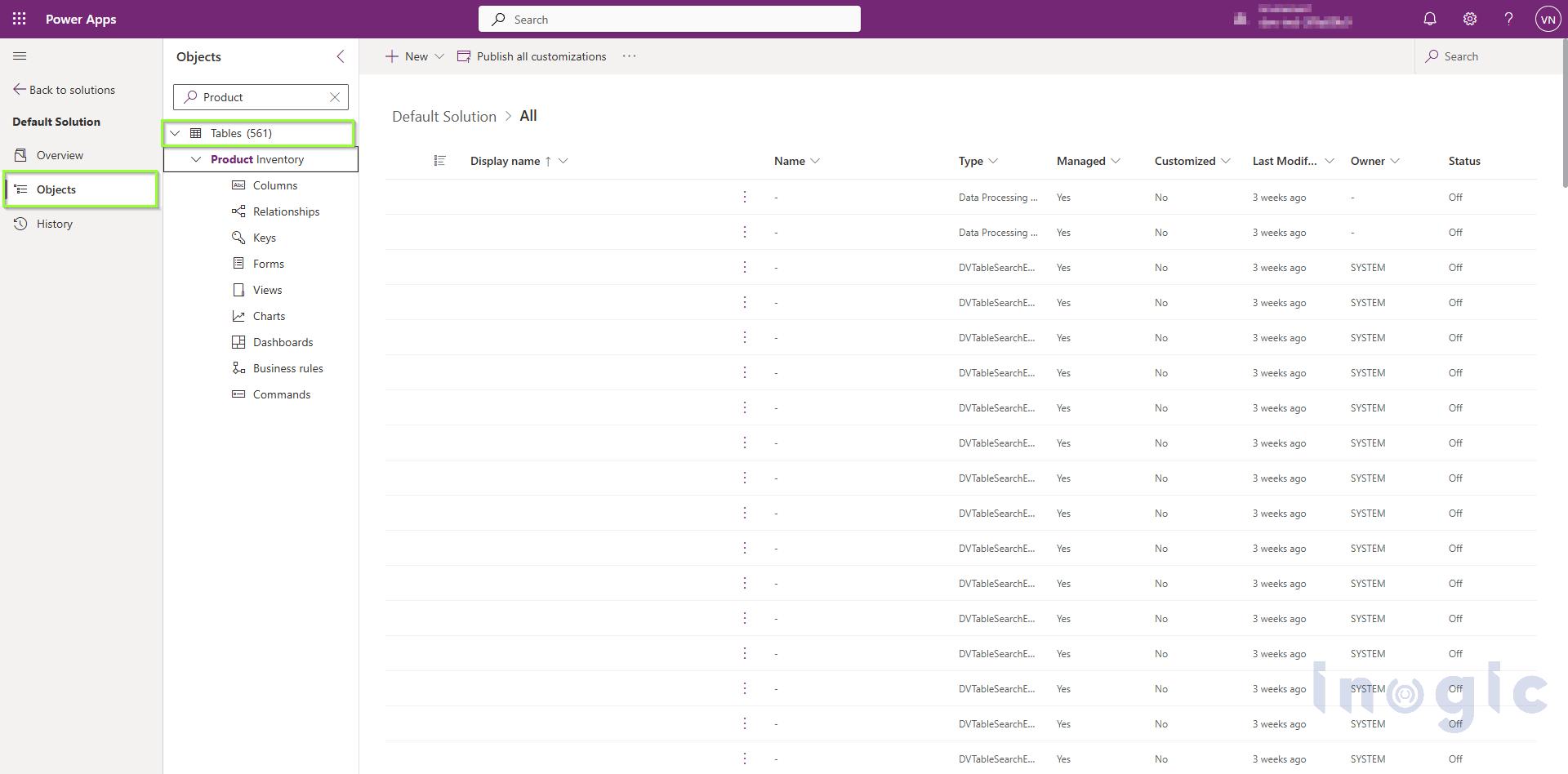
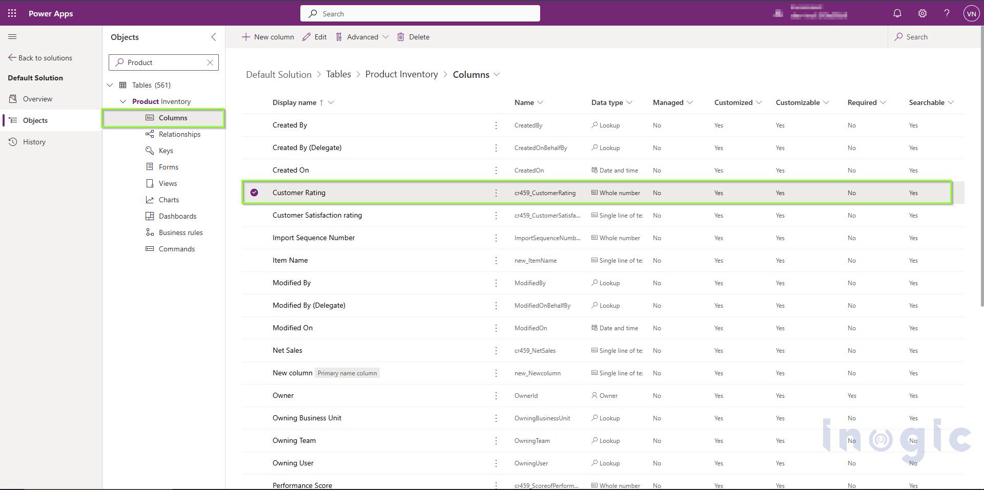
Step 4: Select the Column
From the table properties, select Columns to view the available columns.
Open the column for which you want to configure the visualization.
For this example, let’s open the Customer Rating column.
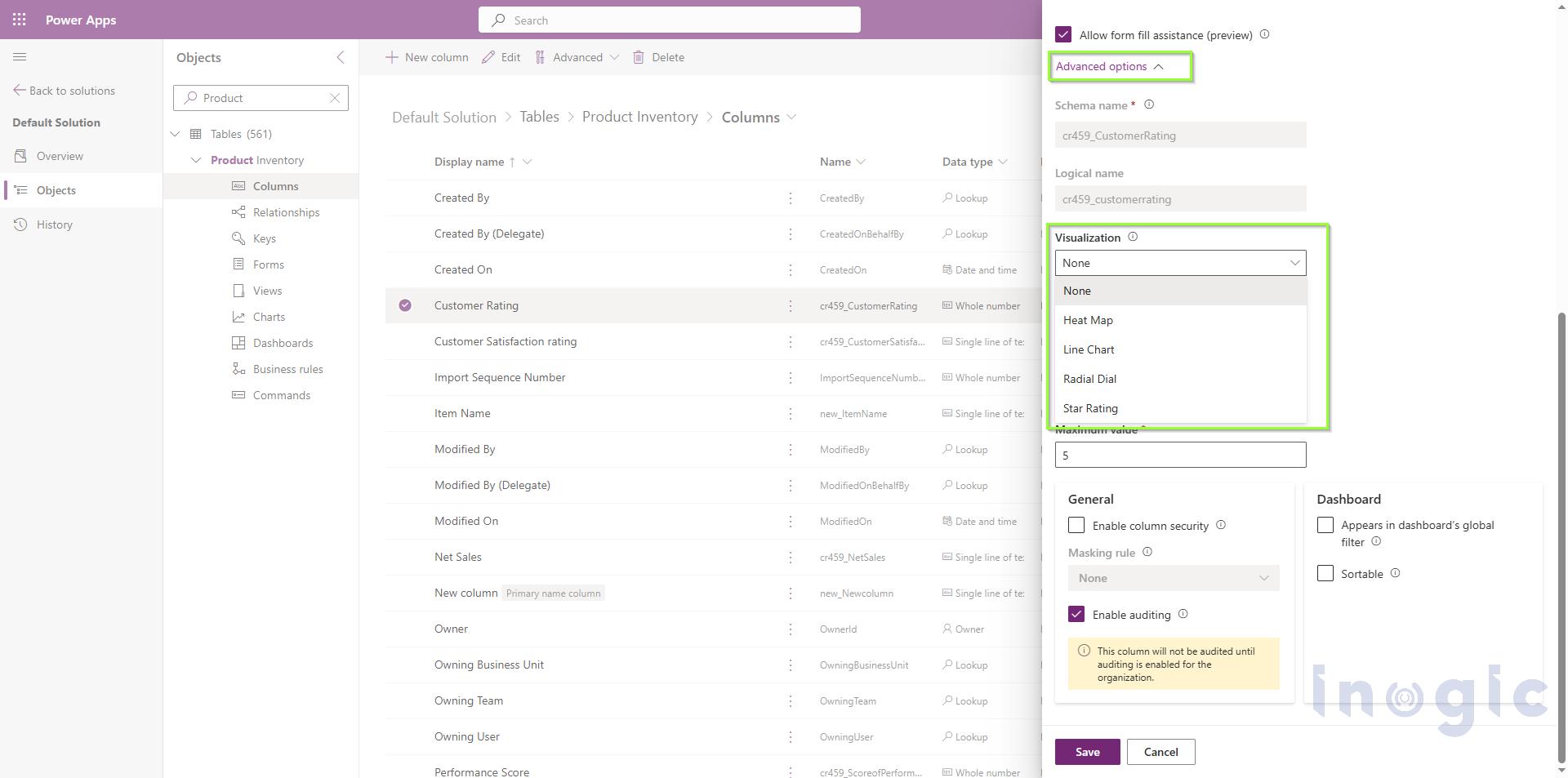
Step 5: Open Advanced Options
Expand Advanced Options in the column properties.
Locate the setting:
Choose how this column’s data will be visualized in the application
The available options are:
- None
- Heat Map
- Line Chart
- Radial Dial
- Star Rating
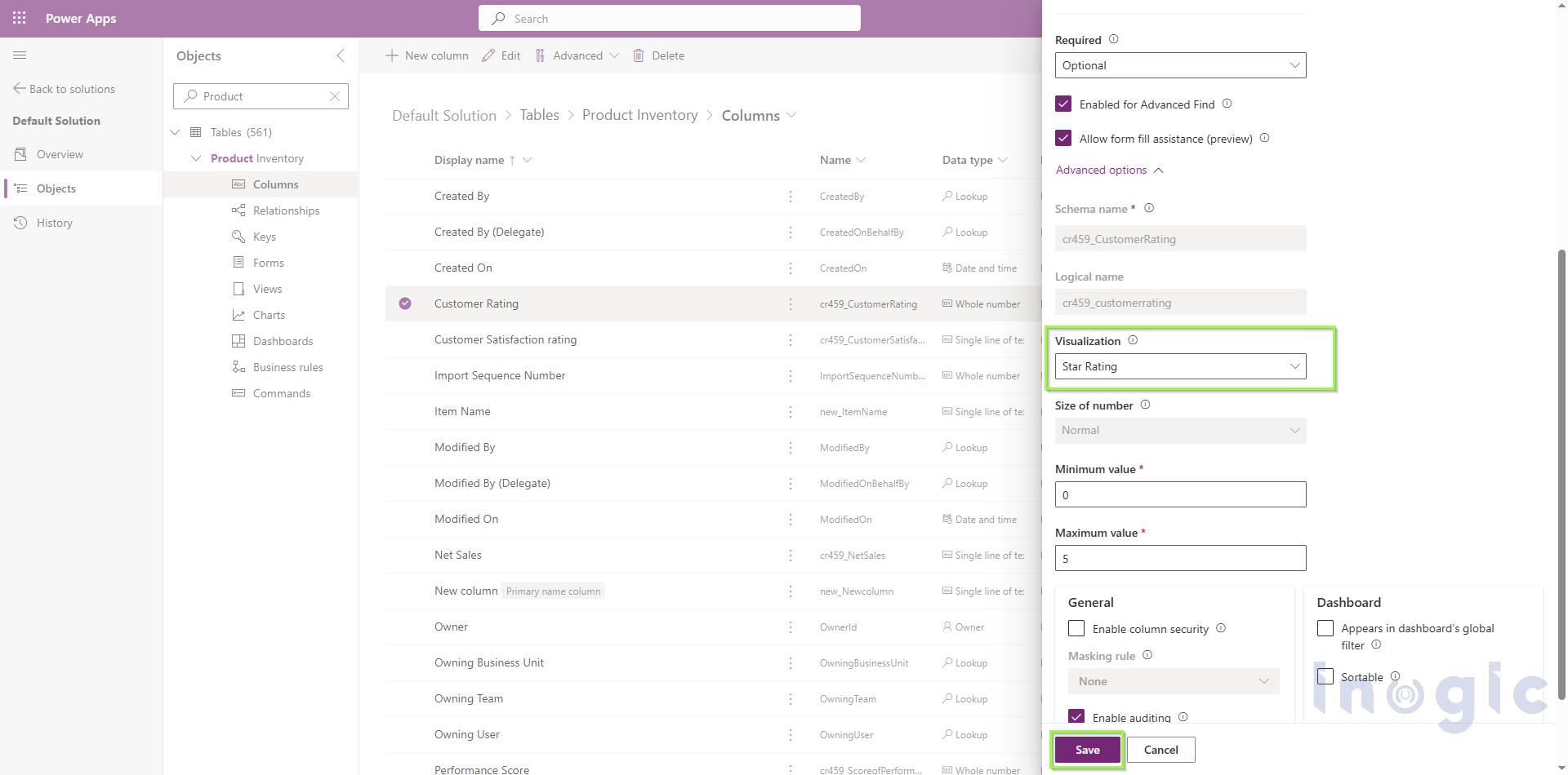
Step 6: Select the Visualization and Save the Column
Select the visualization you want to use.
For this example, let’s select Star Rating.
The Customer Rating column contains values on a 0–5 scale, making it suitable for Star Rating visualization.
Select Save to save the column configuration.
After Using Custom Column Visualization:
After applying the Star Rating, the same data is now represented visually.
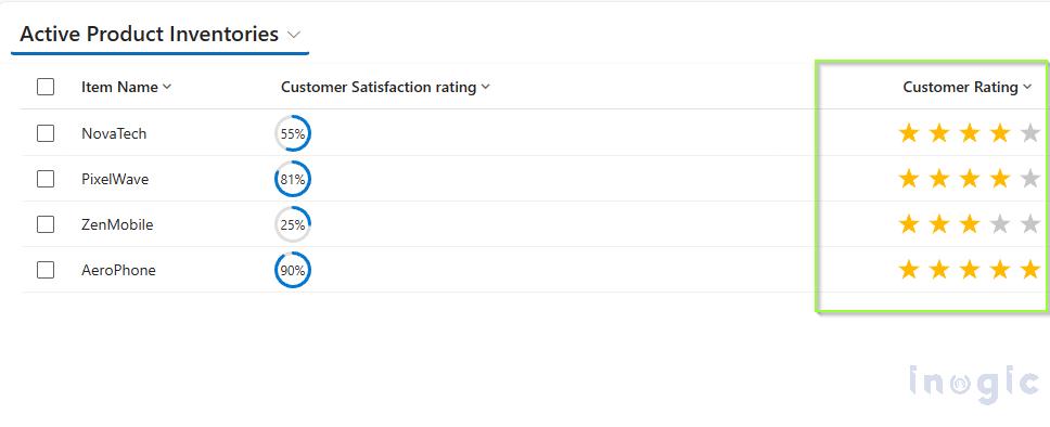
The underlying data has not changed. The same column values are being displayed; only the way those values are rendered in the grid has changed.
For this supported visualization scenario, there is no need to develop and deploy a separate PCF control or web resource simply to render the value as a radial dial.
Understanding the Available Visualizations:
1. Radial Dial:
The Radial Dial displays a single numeric value as a circular ring.
It is suitable for percentages or progress values on a 0–100 scale.
Example
Suppose the NovaTech’s Customer Satisfaction Rating column contains:
- 45
- 75
- 90
After applying the Radial Dial, users can quickly see which product customers are more satisfied with. The visualization accepts whole numbers or decimals, and a trailing percentage sign is also supported.
Tip: If the intended value is 60%, store it as 60 rather than 0.6. A value of 0.6 is interpreted as 0.6%, not 60%.
2. Line Chart:
The Line Chart displays a small trend line inside the grid cell.
It is useful when a record needs to display a sequence of values and users need to understand whether the values are increasing, decreasing, or fluctuating.
Example
The mobile phone company wants to track the quarterly sales of its brands.
For this example, separate columns are created for each quarter:
- Q1 Sales
- Q2 Sales
- Q3 Sales
- Q4 Sales
For example, the sales data for NovaTech is:
- Q1 Sales → 200
- Q2 Sales → 86
- Q3 Sales → 450
- Q4 Sales → 900
A formula is then used to combine these four values into a single field in the required comma-separated format:
200, 86, 450, 900
The resulting field is then configured with the Line Chart visualization.
The Line Chart uses these values to display the quarterly sales trend directly within the grid, allowing users to quickly understand how sales changed from Q1 to Q4.
The Line Chart expects a text column containing multiple numbers separated by commas. At least two values are recommended to display a meaningful trend.
3. Heat Map
The Heat Map displays a value using a horizontal colored bar. The color changes depending on where the value falls within the defined range.
By default, the range is 0 to 100.
Example
The bakery can use a Product Performance Score column:
| Product | Performance Score |
| NovaTech | 90 |
| PixelWave | 76 |
| ZenMobile | 55 |
| AeroPhone | 90 |
The Heat Map allows users to quickly identify products with higher or lower performance.
The Heat Map can also be used with choice columns. For choice columns, the underlying numerical value determines the visualization, so the choice values should be logically ordered.
4. Star Rating:
The Star Rating visualization displays a numeric value using stars.
By default, the visualization contains five stars.
Example
The mobile phone company may also maintain customer ratings for its products.
| Product | Customer Rating |
| NovaTech | 4 |
| PixelWave | 4 |
| ZenMobile | 3 |
| AeroPhone | 5 |
Instead of displaying only the numbers, the values can be represented using stars.
The visualization expects a whole number from 0 up to the number of stars. Decimal values can also partially fill a star.
Data Preparation and Common Issues:
Custom Column Visualizations work correctly when the underlying column data matches the expected format.
Data Preparation:
- Use numeric columns for Radial Dial, Heat Map, and Star Rating.
- Use a text column containing comma-separated numbers for Line Chart.
- Keep values clean and avoid unnecessary text, units, or formatting.
- Make sure values are within the expected range.
- Refresh the grid after changing the visualization.
For example, a Line Chart should contain:
450,620,780
rather than:
2023: 450, 2024: 620, 2025: 780
Common Issues:
The following issues may occur while implementing custom column visualization:
- Radial Dial is full or empty:
Check whether the value is outside the expected range or has been stored as a fraction. - Line Chart shows a single point:
Check that the column contains multiple comma-separated values. - Line Chart contains gaps:
Check for non-numeric values within the series. - Star Rating shows all stars:
Values equal to or greater than the maximum number of stars will fill all stars. - Heat Map doesn’t show the expected order:
For choice columns, check that the underlying numerical choice values are logically ordered.
Custom Visualization vs. PCF or Web Resource:
Custom Column Visualizations don’t replace PCFs or web resources in every scenario.
PCF controls and web resources remain useful when an organization requires a custom visualization or behavior that isn’t provided by the native options.
For example, if the bakery requires a completely custom interactive sales visualization with additional calculations or functionality, a PCF control may still be appropriate.
However, when the requirement is simply to display a supported visualization such as a Radial Dial, Line Chart, Heat Map, or Star Rating, Custom Column Visualizations provide a simpler configuration-based approach.
In simple terms:
Earlier approach
Requirement → Develop PCF/Web Resource → Test → Deploy → Maintain
Current approach
Requirement → Select Visualization → Save → Use in Grid
This reduces the amount of custom development required for common visualization scenarios.
Benefits of Custom Column Visualizations:
Custom Column Visualizations provide several benefits for organizations working with Power Apps and Dataverse grids.
- Reduced custom development for supported visualization requirements.
- Easier configuration directly from column properties.
- Faster comparison of values across records.
- Better grid experience without requiring users to open individual records.
- Consistent visualization across grids and views using the column.
- Reduced maintenance compared with custom solutions.
For the bakery, this means users can understand product sales and performance more quickly without relying only on plain numerical values.
FAQs
Q1: What are Custom Column Visualizations in Power Apps?
Custom Column Visualizations are a native way to display column values graphically inside a Power Apps or Dataverse grid, as a Radial Dial, Line Chart, Heat Map, or Star Rating, instead of showing plain numeric text.
Q2: Do I need a PCF control or web resource to use these visualizations?
No. For the four supported visualization types, you can configure them directly through the column’s Advanced Options, without writing, deploying, or maintaining any custom code.
Q3: What data format does each visualization require?
Radial Dial, Heat Map, and Star Rating expect numeric columns within a defined range (e.g., 0–100 for Radial Dial, 0–5 for a 5-star rating). Line Chart requires a text column containing comma-separated numeric values, such as 450,620,780, with at least two values recommended for a meaningful trend.
Q4: Why is my Radial Dial showing as full or empty?
This usually means the stored value is outside the expected range, or was entered as a fraction (e.g., 0.6) instead of a whole number (e.g., 60 for 60%).
Q5: Why is my Line Chart only showing a single point or has gaps in it?
A single point usually means the column doesn’t contain multiple comma-separated values. Gaps typically indicate non-numeric values mixed into the series.
Q6: Can Heat Map visualization be used with choice columns?
Yes. For choice columns, the visualization is based on the underlying numerical value of each choice, so the choice options need to be logically ordered for the Heat Map to display correctly.
Q7: Should I still use PCF controls if this feature is available?
Yes, in some cases. Custom Column Visualizations cover common scenarios well, but PCF controls or web resources are still the right choice when you need a fully custom visualization or interactive behavior beyond the four supported types.
Q8: Is this feature ready for production use?
Not yet guaranteed. Custom Column Visualizations for Grids is currently a preview feature and may change before general availability, so it should be evaluated and tested before relying on it in a production environment.
Conclusion:
Custom Column Visualizations provide a simple way to make Power Apps and Dataverse grids more informative and easier to understand.
Visualizations such as Line Charts, Radial Dials, Heat Maps, and Star Ratings can help users quickly compare and interpret different types of business data directly within a grid.
Previously, organizations could use PCF controls or web resources to introduce graphical representations inside their grids. These technologies remain useful for highly customized requirements, but they can involve additional development, deployment, and maintenance.
With Custom Column Visualizations, common visualization requirements can now be handled directly through column configuration without custom development.
By selecting the appropriate visualization and preparing the data in the required format, organizations can improve the grid experience while making business data easier to interpret.
Note: Custom Column Visualizations for Grids is currently a preview feature and should be evaluated accordingly before being used in production scenarios.