Microsoft Dynamic CRM 2013/2011 provides an easy way to create different types of charts that helps user to analyze their data. We can create multi-series chart to compare multiple values side-by-side.
One of our clients required a chart that will compare the Actual Revenue (Opportunity) and Budgeted Amount (Customer) group by month (Actual Close date). The horizontal axis of chart should show the month (Actual close date) and vertical axis should show the scale in currency.
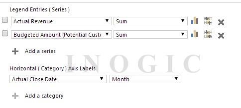
We first tried it by using the OOB chart by setting the legend series and category as below:
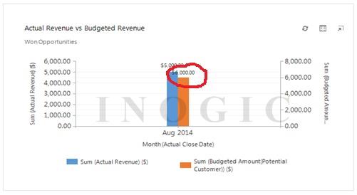
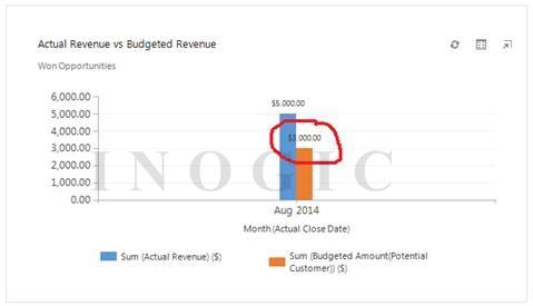
The chart shows data as below, where blue bar shows sum of Actual Revenue of opportunities and orange bar shows sum of Budgeted Amount of its associated Account.
But in case for single customer if there are multiple opportunities then chart functionally shows incorrect data.
We are saying incorrect data as we have two opportunities for same customer with Actual Revenue and Budgeted Revenue as below:
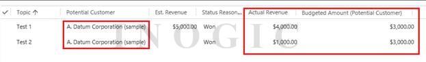
Chart sum the Actual Revenue to 5000 for different opportunities which is correct but it also sum Budgeted Amount to 6000 for same customer as it should be only 3000.
The chart should combine the Budgeted Amount for same customer. To fix this we edit the fetch xml of this chart.
Below are the steps that will explain how we fix this:
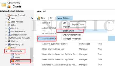
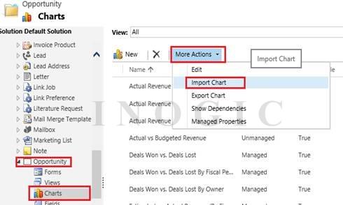
- Export chart to get the XML file.

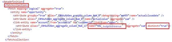
- Open the downloaded xml file, find the “fetchcollection” and add “distinct=true” for Budgeted Revenue attribute which is inside in link-entity.

- This causes to sum the budgeted revenue of distinct account.
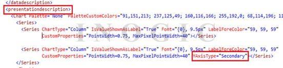
- You may have noticed in first image that there are two different scales for each series i.e. one for Actual Revenue and one for Budgeted revenue. To use the same scale for both series, remove the “YAxisType” attribute of second series which is under <presentationdescription> tag.
- Save XML and then import it.

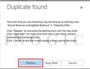
- Click on Replace to overwrite the existing chart and publish all customizations.

- Now you can see that chart shows the sum the Budgeted Amount of distinct Accounts.

Hope this article helps you.