Microsoft is always rolling out updates to improve the Dynamics and Power Apps experience. Recently, Microsoft introduced Grid Containers in Power Apps.
Grid Containers are an improved version of the standard horizontal and vertical containers. They make it easier to design app layouts by letting you define rows and columns, similar to how tables work.
When building responsive apps, we often need to write many formulas and make complex structural changes. Grid Containers simplify this process by providing a more structured and flexible layout system. As a result, they are very useful for creating clean and responsive app designs with less effort.
What is Grid Container?
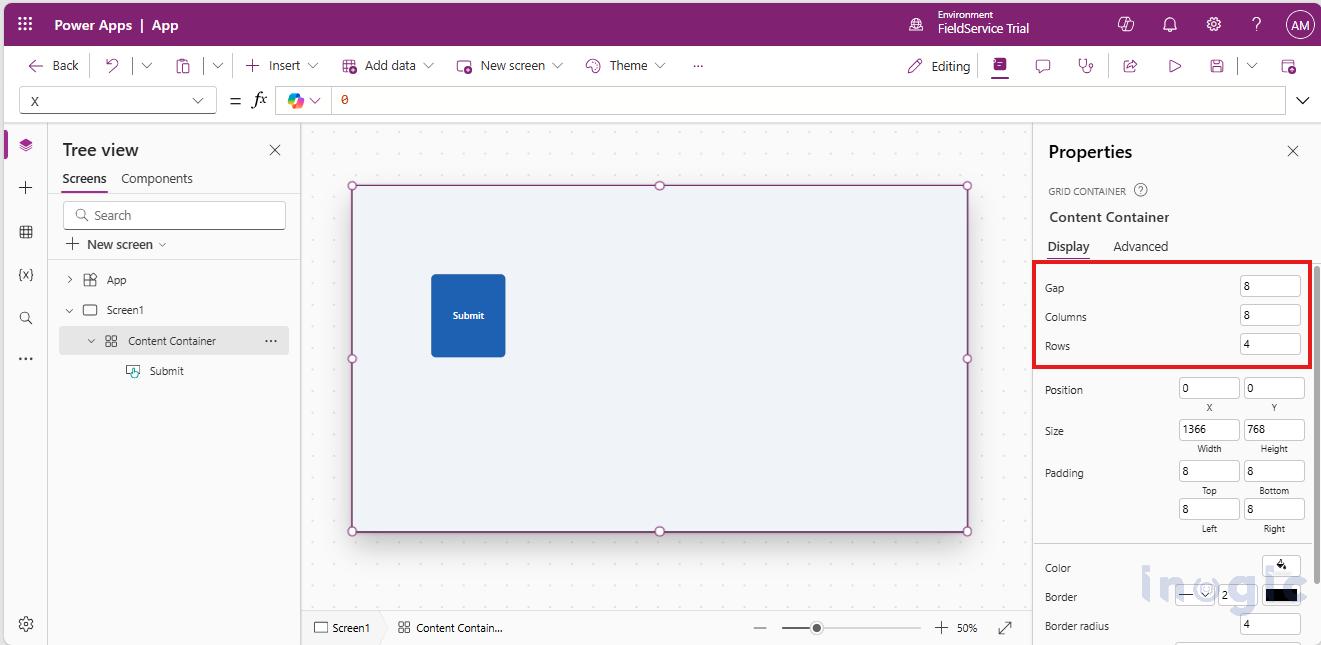
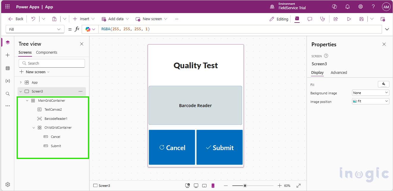
The Grid Container is a row and column-based structure where you just define rows and columns for layout first and then we can add other components inside it as its child.
We are allowed to adjust the spacing, alignment and gap between the child components of grid.
Each component’s position can be finely controlled through defined row and column settings.
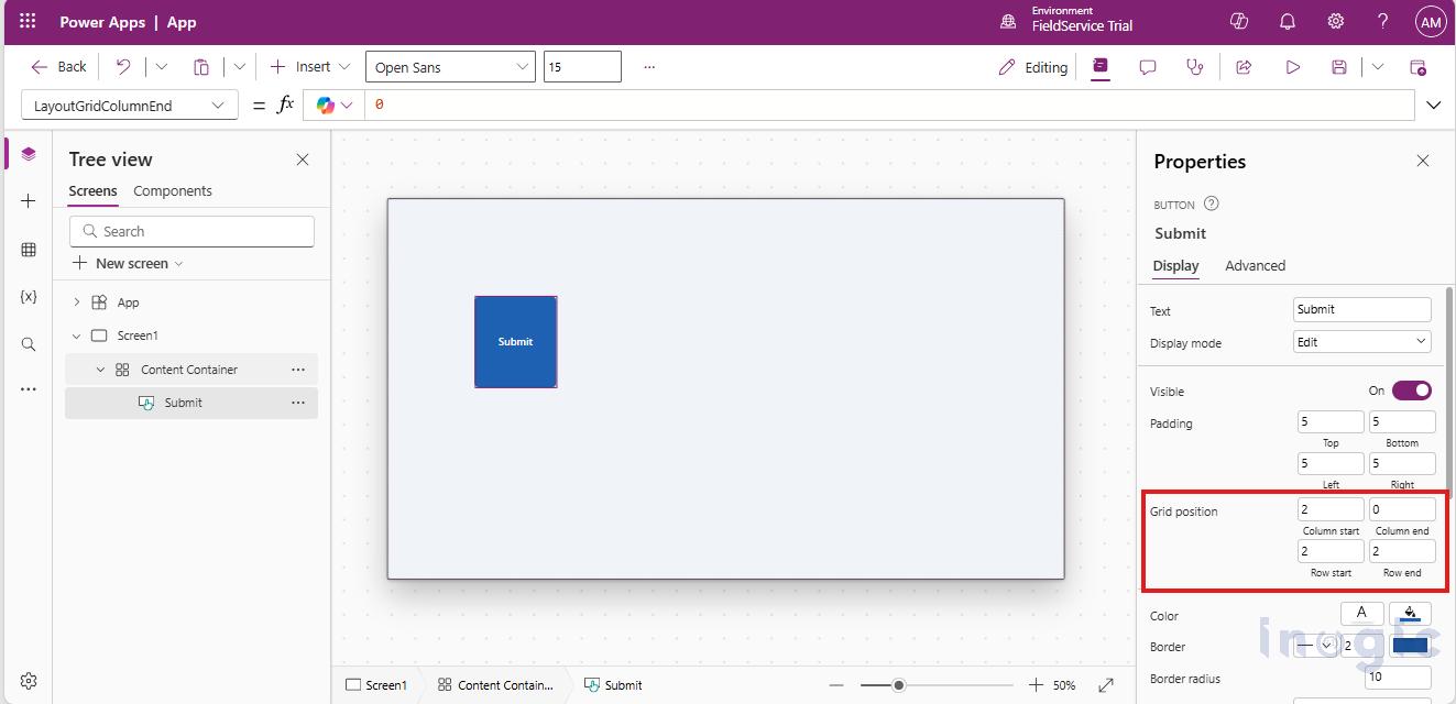
Grid Containers also provide properties to control the position of child components within the grid. Using Column Start / Column End and Row Start / Row End, we can easily define where a component should be placed inside the grid. This gives better control over the layout while keeping the design clean and responsive.
- Column Start / Column End: Defines the starting and ending columns that a child component occupies within the grid.
- Row Start / Row End: Defines the starting and ending rows that a child component occupies within the grid.
With this approach, components are placed automatically, so manual positioning isn’t required. Your apps become more maintainable and responsive. The Structure also gets readable and more maintainable when we use the grid containers.
Earlier, to handle responsive design in apps, we mainly relied on X and Y properties along with formulas to control the height, width, and position of components. As the app grew larger, the layout became increasingly complex, and even adding a single new component could break the entire design.
To manage this, we often used formulas like the one below, which depend on tracking the parent container’s height and width. While effective, this approach made layout management harder and more error-prone as the app scaled.
If(MainGridContainer.Width > 600, MainGridContainer.Height * 0.5, ChildGridContainer.Height * 0.5)
With Grid Containers, this is much easier. The grid container handles layout and responsiveness by default, automatically managing its child components. This makes the app more stable, easier to maintain, and much simpler to scale as new components are added.
Note: Ensure the Authoring version is set to 3.25123.7 or above as the grid container is available only in newer Power Apps authoring versions. You can change the Authoring version from Settings → Support.
The Simple difference between the normal containers and grid containers are as follows:
Grid Container vs Standard Containers
|
Aspect |
Standard Containers |
Grid Container |
|
Responsiveness |
Formula-driven |
Structure-driven |
|
Layout stability |
Fragile as app grows |
Predictable |
| Maintenance | High |
Lower |
|
Readability |
Formula-heavy |
Cleaner |
| Multi-device support | Manual |
Built-in |
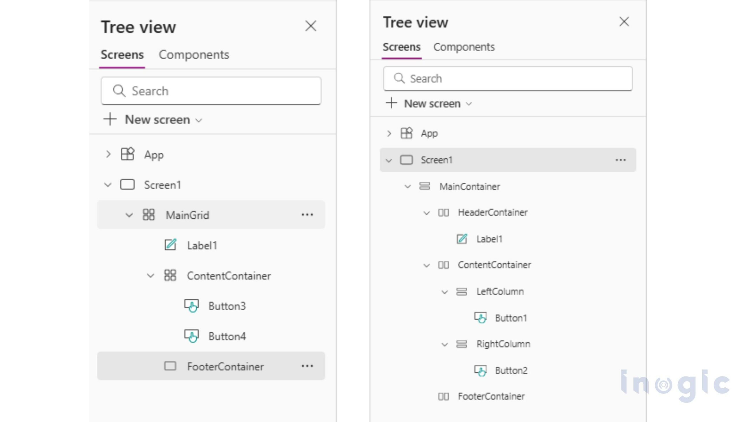
The difference is also clearly visible in the UI structure. The images below show how the same UI design looks when built using normal Horizontal/Vertical containers versus grid containers. With grid containers, the structure is cleaner, more organized, and easier to manage compared to the traditional container-based layout.
Grid design also gives you the flexibility to use nested grids. You can place a grid container inside another grid container, which helps in creating more structured, scalable, and robust design patterns for your app layouts.
Nested grids allow you to break complex screens into smaller, manageable sections, making the UI easier to design and maintain. They are especially useful for layouts that need different alignment rules within the same screen. By combining grids, you can achieve better consistency, improved responsiveness, and cleaner app architecture without relying on complex formulas.
FAQs
What is a Grid Container in Power Apps?
A Grid Container in Power Apps is a layout container that organizes components using rows and columns. It allows developers to define the structure first and then place components within the grid, making responsive design simpler and more predictable.
How is a Grid Container different from standard containers in Power Apps?
Standard containers rely heavily on formulas and X/Y positioning, while Grid Containers use a structured row-and-column layout. This makes Grid Containers more stable, easier to maintain, and better suited for responsive designs.
Why should I use Grid Containers for responsive Canvas Apps?
Grid Containers automatically manage component placement and resizing across screen sizes. This reduces the need for complex formulas and makes apps more responsive, scalable, and easier to maintain.
Do Grid Containers eliminate the need for X and Y positioning?
Yes, in most scenarios. Grid Containers place components automatically based on row and column settings, reducing or eliminating the need to manually control X and Y properties.
Can Grid Containers be nested in Power Apps?
Yes, Grid Containers can be nested inside other Grid Containers. Nested grids help break complex screens into smaller sections, making layouts more structured and easier to manage.
Wrapping Up
The Grid Container takes a simpler approach. You define the layout structure once using rows and columns, and the app adapts naturally across screen sizes. There’s less layout logic to manage and fewer things that can break later.
Grid doesn’t replace every scenario. For simple screens, standard containers are still a good fit. But for responsive and scalable layouts, Grid Containers make the design clearer and easier to maintain.
In short, Grid helps you focus more on building features and less on fixing layouts.