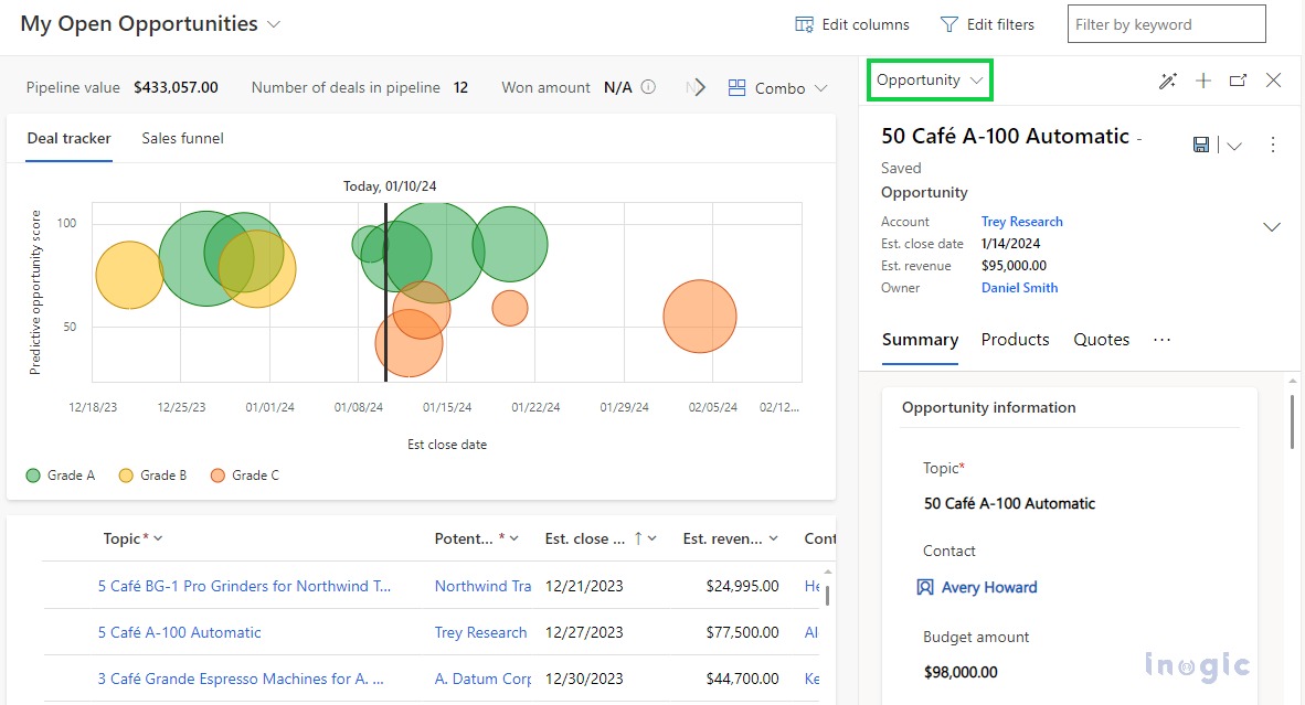
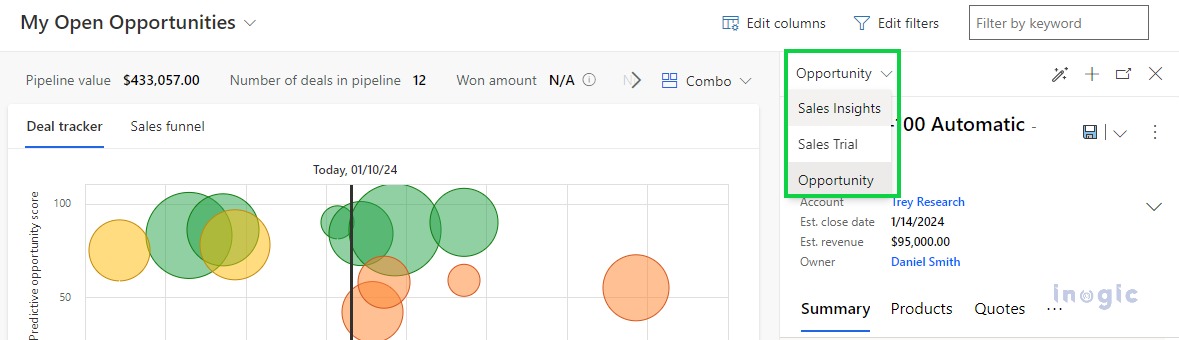
Opportunity Pipeline View visualizes the data and displays it in graphical formats based on the current pipeline phase of the records which helps the seller to find the records they want more quickly than the standard read-only grid. You can find more details regarding the look and feel of the same in the Pipeline View in the Microsoft Dynamics 365 blog.
In this blog, you will see how we configure or customize the Opportunity Pipeline view!
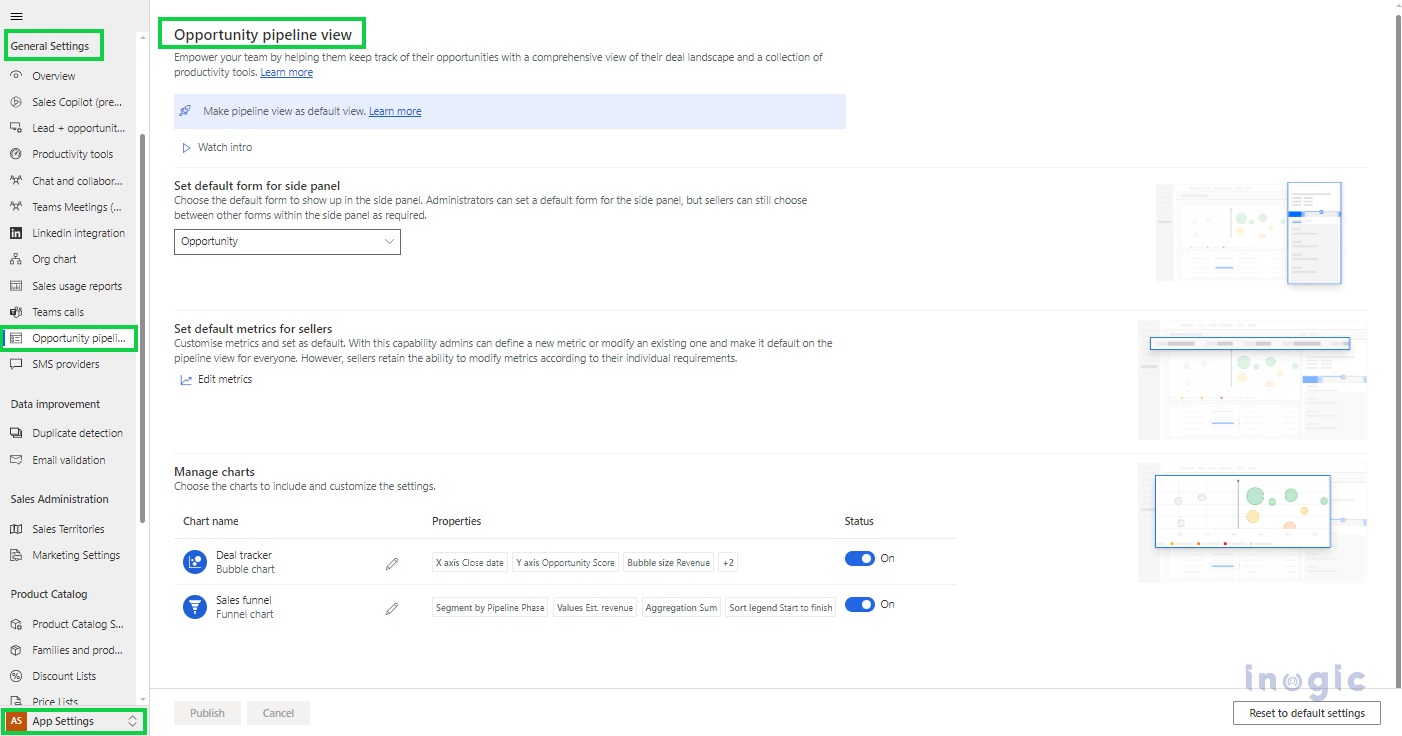
1. In the Sales Hub, change the area to App Settings.
2. Under General Settings, select Opportunity Pipeline view.
Make Pipeline view as default view:
You can set the Opportunity pipeline view as the default view so that you don’t have to switch to it every time you access the opportunity list.
For the same, go to the Customization > Customize the system > Entities > Opportunity > Control tab and select the pipeline view for the web, phone, and tablet as required. Also, you can configure related properties for the same as shown below,
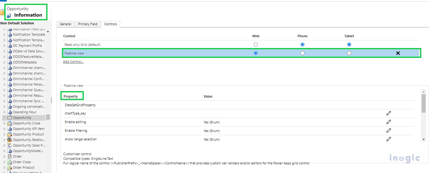
Note: If you don’t see the Pipeline view in the control list, click on Add Control to find and add the same. If you don’t find the Pipeline view in the list of controls, you can look for the Deal Manager workspace control.
Set default form for side panel
You can set the default form for the opportunity to be displayed in the side panel when the seller opens the opportunity record from the opportunity pipeline view. Also, you can create a custom form for an opportunity, especially for the side panel, and set it as the default form.
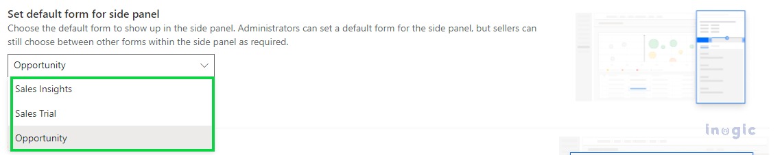
Also, the sellers can switch to a different form as preferred, and that respective form will be set as the default form for the respective seller.
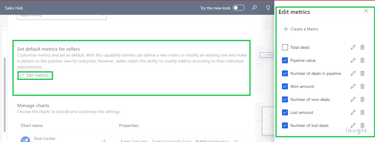
Set default metrics for sellers
Here you can set the default metrics for all the sellers by clicking on the Edit Metrics button as shown below,
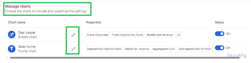
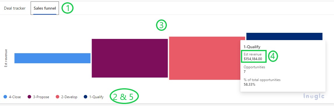
Customize Charts
You can customize the Deal tracker (i.e. Bubble chart) and Sales funnel (i.e. Funnel chart) to change the information that the seller views by clicking on the Edit icon present beside chart names,
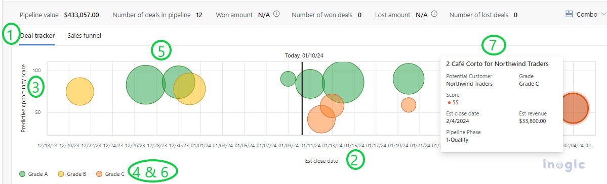
Edit Deal tracker (i.e. Bubble chart)
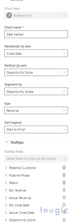
1. Chart Name à Here you can set the name of chart as required.
2. Horizontal (x) axis à Here you can select any DateTime field like Created On, Modified On, Est. close date, etc.
3. Vertical (y) axis à Here you can select any numeric field like Est. Revenue (currency), Probability (whole number), etc.
4. Segment by à Here you can select what the color codes indicates like you can select the Opportunity Grade to color code the bubbles based on the grade of opportunity.
5. Size à Here you can select any numeric field like Est. Revenue (currency), Opportunity Discount (%) (Decimal) to indicate the size of the bubble.
6. Sort legend à Here you can select how you want to sort the chart legend like Start to Finish or Finish to Start where legend indicates the color used for each segment. For example, if you have selected Opportunity Grade as the segment by, then the legends will be soreted based on the chronological order of the Opportunity Grade.
7. Tooltips à Here you can select the details you want user to view as tooltips when they hover over a bubble. You can add maximum of 8 fields
Edit Sales funnel (i.e. Funnel chart)
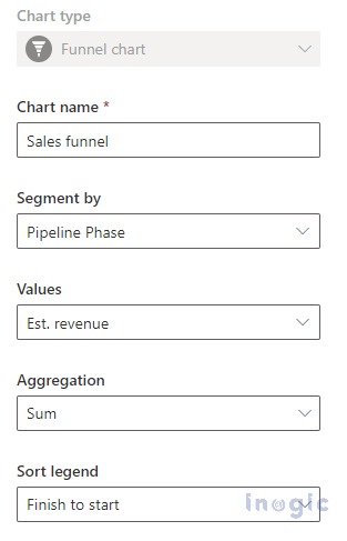
1. Chart Name à Here you can set the name of chart as required.
2. Segment by à Here you can select what the color codes indicates like you can select the Pipeline Phase to color code the funnel based on the phases.
3. Values à Here you can select the field for sizing the bars in the funnel.
4. Aggregation à Here you can select the aggregate function to use for the Values field. For example, if you select the Est. revenue in the values and use Sum aggregation function then on hover over the segment in the funnel chart, you will see the aggregate value for the Est. revenue.
5. Sort legend à Here you can select how you want to sort the segments like Start to Finish or Finish to Start. For example, if you have selected Pipeline Phase as the segment by and sorted as Finish to Start, then the pipeline phase display the funnel from the last pahse to first phase i.e. from Close to Qualify.
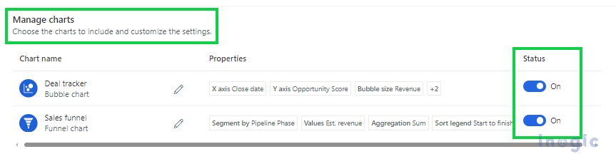
Also, you can hide the chart if you don’t want to allow a seller to see it by turning off the Status toggle as shown below,
Conclusion
Customize the pipeline view to organize opportunities in a way that helps sellers make it easy to view or update information.