Power BI provides powerful built-in visuals, but sometimes you need custom behavior—such as animated line transitions when filters change. In this blog, we’ll build a custom animated line chart using pbiviz, TypeScript, and D3.js.
By the end of this article, you’ll know how to:
- Create a custom Power BI visual using pbiviz
- Bind categorical data dynamically
- Animate line transitions when filters or slicers change
- Package and import a .pbiviz file into Power BI Desktop
Why Custom Visual Animation?
Native Power BI line charts don’t provide fine-grained animation control. With a custom visual, you can:
- Animate lines smoothly on filter change
- Highlight trends more clearly
- Create interactive storytelling dashboards
Prerequisites
Before we begin, ensure you have:
- Node.js (LTS)
- Power BI Desktop
- pbiviz CLI
- Basic knowledge of TypeScript and D3.js
Install pbiviz:
npm install -g powerbi-visuals-tools
Step 1: Create the Custom Visual Project
pbiviz new animatedLineChart
cd animatedLineChart
pbiviz start
This scaffolds a Power BI custom visual project with:
- visual.ts
- capabilities.json
- visual.less
Step 2: Define Data Roles in capabilities.json
{

"dataRoles": [

{

"name": "category",

"kind": "Grouping",

"displayName": "X-Axis"

},

{

"name": "values",

"kind": "Measure",

"displayName": "Y-Axis"

}

],

"dataViewMappings": [

{

"categorical": {

"categories": {

"for": { "in": "category" }

},

"values": {

"select": [{ "bind": { "to": "values" } }]

}

}

}

]

}
This configuration allows users to drag:
- A date or category to the X-axis
- One or more measures to the Y-axis
Step 3: Create Scales Dynamically
const xScale = d3.scalePoint()

.domain(data.map(d => d.category))

.range([margin.left, width - margin.right]);


const yScale = d3.scaleLinear()

.domain([0, d3.max(data, d => d.value)!])

.nice()

.range([height - margin.bottom, margin.top]);
Scales update automatically when filters change.
Step 4: Animate Line Transitions
This is where the magic happens
this.linePath

.datum(this.data)

.transition()

.duration(800)

.ease(d3.easeCubicInOut)

.attr("d", this.lineGenerator);
Every time a slicer or filter changes:
- Power BI calls update()
- The line smoothly animates to the new shape
Step 5: Handle Filter Changes
Power BI automatically triggers update() when:
- Slicers change
- Filters are applied
- Visual interactions occur
No extra event handling is required—just redraw using transitions.
Step 6: Add Styling & Formatting
You can expose formatting options like:
- Line thickness
- Line color
- Animation duration
- Axis labels
Using enumerateObjectInstances():
instances.push({

objectName: "lineSettings",

properties: {

lineWidth: this.settings.lineWidth

},

selector: null

});
Step 7: Package and Import the Visual
pbiviz package
This generates:
dist/animatedLineChart.pbiviz
Import it into Power BI Desktop:
- Visualizations → (…) → Import a visual
Conclusion:
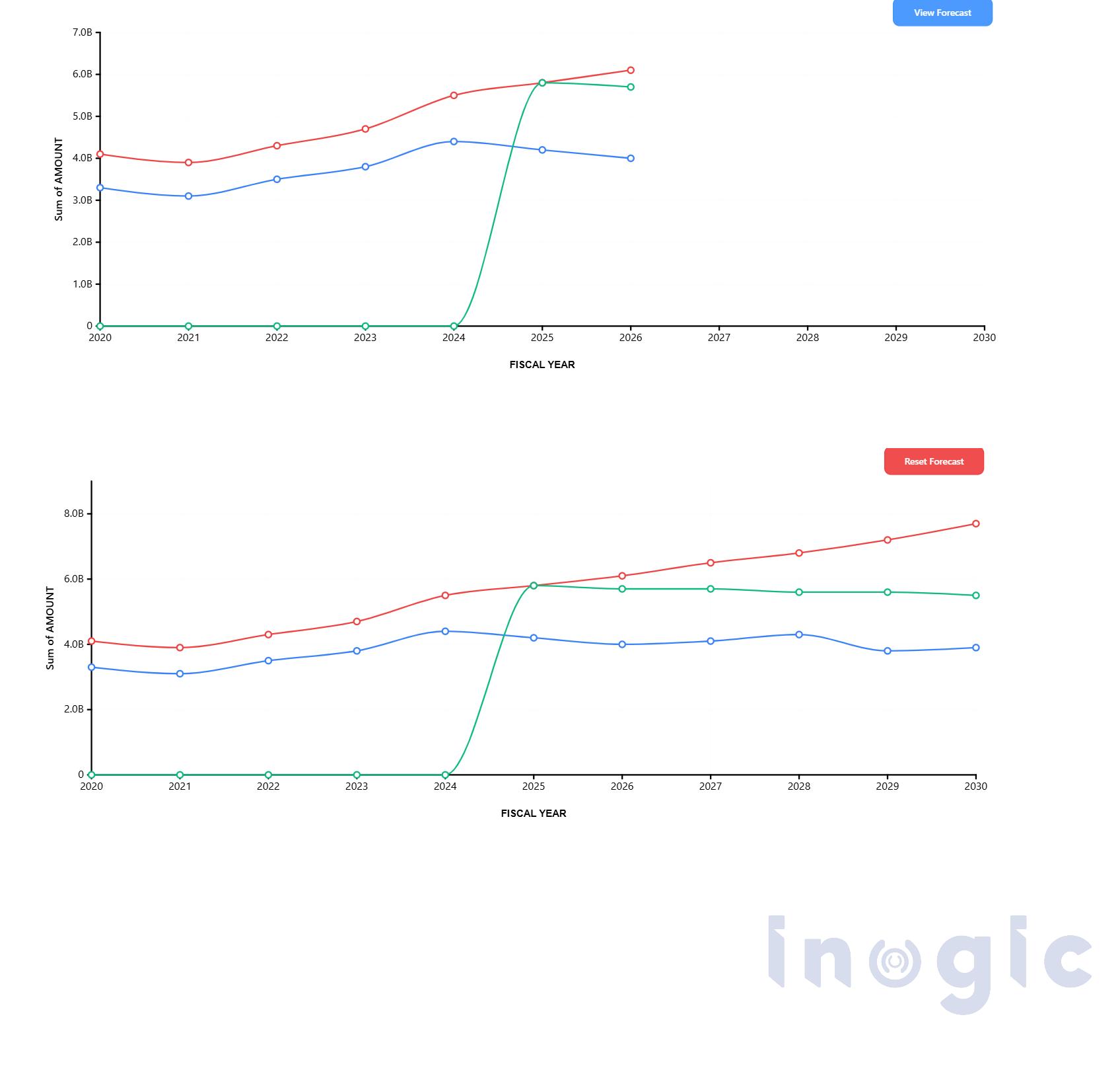
Animated line charts significantly enhance Power BI dashboards by making data transitions easier to follow especially when users interact with filters and slicers.
By leveraging custom visuals with D3.js, organizations can:
- Improve visual continuity
- Reduce cognitive load during data exploration
- Support clearer discussions around trends and performance
- Enable more engaging executive dashboards
This approach transforms dashboards from static reporting tools into dynamic, insight-driven experiences, making them particularly valuable for executive reviews, operational analysis, and advanced data storytelling.
FAQs
Can Power BI create animated charts without custom visuals?
Native visuals offer limited animation control. For advanced animations, a custom visual built with pbiviz and D3.js is required.
Does Power BI automatically trigger updates on filter changes?
Yes. Power BI automatically calls the update() method whenever filters, slicers, or interactions modify the data context.
Is D3.js supported in Power BI custom visuals?
Yes. D3.js is commonly used inside Power BI custom visuals to create advanced SVG-based charts and animations.
Can this visual be published to the Power BI Service?
Yes. Once packaged, the .pbiviz file can be uploaded and used in both Power BI Desktop and Power BI Service reports.
Is animation performance impacted with large datasets?
Yes. For large datasets, you may need to optimize transitions and reduce DOM elements to maintain performance.